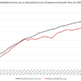
Before I begin, let me say that if you haven’t read yesterday’s article, please do because it represents the important argument: the Phillips Curve doesn’t need rehabilitating because it is working fine. In fact, I would argue that the Phillips Curve – relating wages to unemployment – is a remarkably accurate economic model prediction. The key chart from that article I reproduce here, but the article (which is brief) is worth reading.

Following my publication of that article, I had a few more thoughts that are worth discussing on this topic.
The first is historical. It’s incredibly frustrating to read article after article incorrectly stating what the Phillips Curve is supposed to relate. Of course one writer learns from another writer until what is incorrect becomes ‘common knowledge.’ I was fortunate in that, 30 years ago, I had excellent Economics professors at Trinity University in San Antonio, and I was reflecting on that fact when I said to myself “I wonder if Samuelson had it right?”
So I dug out my copy of Economics by Samuelson and Nordhaus (the best-selling textbook of all time, I believe, and the de rigeur Intro to Economics textbook for generations of economists). My copy is the 12th Edition, so perhaps they have corrected this since then…but on page 247, there it is – the Phillips Curve illustrated as a “tradeoff between inflation and unemployment.” Maybe that is where this error really propagated – with a Nobel Prize-winning economist making an error in his incredibly widely-read text! Interestingly, the authors don’t reference the original Phillips work, but refer to “writers in the 1960s” who made that connection, so to be fair to Samuelson and Nordhaus they were possibly already repeating an error that had been made even earlier.
My second point is artistic. In yesterday’s article, I said “The Phillips Curve…simply says that when labor is in short supply, its price goes up. In other words: labor, like everything else, is traded in the context of supply and demand,…” But students of economics will note that the Phillips Curve seems to obfuscate this relationship, because it is sloping the wrong way for a supply curve – which should slope up and to the right rather than down and to the right. This can be remedied by expressing the x-axis of the Phillips Curve differently – making it the quantity of labor demanded rather than the quantity of labor not demanded…which is what the unemployment rate is. So the plot of wage inflation as a function of the Employment Rate (as opposed to the Unemployment Rate) has the expected shape of a supply curve. More labor is supplied when the prices rise.


Leave A Comment