
We couldn’t help but think of the rock formation El Capitan in Yosemite National Park. The chart below shows the S&P 500’s 10-day A/D line over the last year. If you are unfamiliar with the term 10-day A/D line, it is simply a rolling 10-day total of the net number of stocks in the S&P 500 rising and falling on a daily basis.
When the line is positive it means more stocks are rising than falling, while a falling line means the opposite. Over the course of the last two weeks since the S&P 500’s closing high on 1/26, the 10-Day A/D line has seen an outright collapse, falling to levels not seen at any point in the last year.
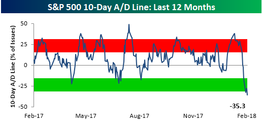
While the big drop in the 10-day A/D line is a big outlier relative to levels from the last year, from a longer-term vantage point, there have been several other periods where the 10-day A/D line was as low or lower. The most recent occurrences came back in early 2016 when the S&P 500 was getting off to its worst start to a year on record. Before that, we saw another extreme reading back in August 2015. Besides these two instances, other periods during the current bull market where the 10-Day A/D line was more negative than it now came in May 2010 (Europe Debt Crisis), August 2011 (US Debt Downgrade), and May 2012 (Greek Debt Crisis).


Leave A Comment