
This Great Graphic comes from Bloomberg. It is a more complicated look at the relationship between the US stocks and bonds. In particular, we are looking at the S&P 500 and the 10-year US generic yield.
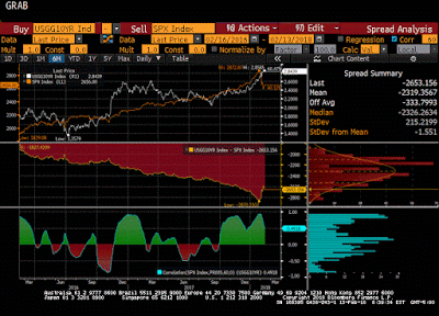
There are three separate charts here. The top one is a simply line chart. The S&P 500 is the orange line and the 10-year yield is the white line. This chart has been shown ad nauseam. It is misleading. It shows the two variables on the same chart, but with two different scales.
The eye naturally goes to where the lines cross. Eureka: This shows that while stocks rallied alongside with rising yields, but then choked off the bull market. Beware of optical illusions and curve fitting. The lines did not cross, that is the optical illusion caused by curve fitting. There is nothing that says 2900 in the S&P 500 is the same as 2.90% yield of the 10-year note, or the 2700 in the S&P 500 is aligned with 2.50% yield. Ultimately, the only thing can be said about the top chart is that bond yields remains firm when the S&P 500 dropped.
If possible, the second chart is even less useful. It is created by simply subtracting the price of the S&PO 500 from the yield.It is arithmetic difference of the S&P 500 and 10-year yield.
The lowest of the three charts is the most useful. It shows the correlation between the S&P 500 and the US 10-year yield. The correlation was done on the level of the two variables and covers the past two years.The correlation over the past 60 days is 0.49. It has been positive since last September. There were three distinct periods last year that the correlation was inverse and four such period in 2016. The blue bar chart shows the distribution of the correlation and there are three modes (clusters of frequencies); near the top, a bit lower than the current correlation, and a small inversion. This is to say that the relationship between bonds and equities seems well within what has been experienced over the past couple of years.


Leave A Comment