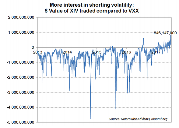
Today’s edition of ChartCritic takes a look at a chart that was shared by Jesse Felder on Twitter which shows the relative $ value traded in the major long and short VIX ETFs. The chart is by Macro Risk Advisors and appeared in an article on Business Insider. This time it’s a mixed critique, the main merit is that it is a unique and interesting angle, and the main short-coming is the incomplete view it presents. The other thing that would be nice would be to show it against the VIX itself to gauge whether or not it has a meaningful signal from a timing perspective. So overall very interesting chart, but needs a little bit of work…
Now, for the second part of the ChartCritic – where we add our own chart to the mix. I actually covered a very similar topic in the latest weekly report for clients, which looked at AUM (Assets Under Management) of long and leveraged-long VIX ETF AUM. Anyway in the response-chart I thought I would show: 1. An AUM view instead of value traded; 2.a Greater coverage (i.e. include the AUM of all the VIX ETF product); 2.b Include the leveraged long ETFs; and 3. Show it against the level of the VIX. The results are quite interesting. Long VIX ETF AUM moves roughly sideways (the vicious futures roll costs chomps up any new money that comes in over time). The good thing about that is that you can see surges in interest in buying protection/hedging as the value of long VIX AUM rises – and there’s a number of occasions where that actually precedes a spike in the VIX.
Here’s the chart in question. It shows the difference in value traded between XIV and VXX.
Not much in the way of useful signals, but it is interesting to note that despite big tailwinds for short-VIX strategies and massive headwinds for long-VIX strategies [i.e. just look at their return since inception] total long bets continue to exceed total short bets (a couple of temporary exceptions).

Related Posts
 SEC charges FTX CEO SBF for defrauding investors a day after his arrest
 Crude Oil Elliott Wave View: Bounce Expected Soon
- AMC Theatres CEO considers adding Shiba Inu as payment for ticket purchases
 T2108 Update – Full Bull (FB) Part Two
- Chicago PMI Plunges Into Contraction
 Four Ticking Global Time-Bombs Few Even Hear


Leave A Comment