

Last week, we talked about support and resistance – both of which drive the technical study of the financial markets.
Let’s expand on this theory by introducing another key technical idea, one that applies to far more than just investing.
That is, the fact that history repeats itself.
For example: Whether you believe in seasonality or not, January’s stock performance mirrored that of the last 10 years.
Since 2006, the Dow Jones Industrial Average (DJIA) has logged an average decline of 2.3% in January. Over the first month of 2016, the DJIA declined 4%. The prevailing monthly downtrend has held.
From intraday peak to trough, the DJIA plummeted even more – 13%. But the DJIA rallied sharply off the mid-month lows and tested its overhead 20-day moving average (DMA).
Now, a familiar bullish pattern is showing up on stock charts across the entire market. Today, I’m going to show you how to read it and trade it like a pro.
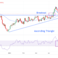
The Triangle Offense
One of the chart patterns you should always watch for following a steep selloff is the ascending triangle.

The ascending triangle pattern forms as the support line for a stock rises and shares meet overhead resistance at the same time. This chart pattern tells us that demand for shares in a company is rising – a bullish sign by any measure.
So, what does this chart pattern have to do with selloffs?
When share prices reverse a previous downtrend, they usually test recent highs as buyers return. A trader who wants to take a long position in such a stock need only wait for shares to “break out” above the resistance.
More aggressive traders who are confident in the trend will often take their positions ahead of the break. These traders buy when shares retrace to the support line after a failed test of resistance.
Either way, if the resistance becomes support, shares will likely enjoy a nice run up the chart as new buyers rush in.


Leave A Comment