
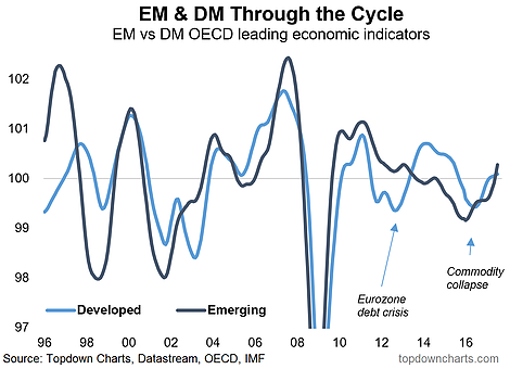
Going through the latest numbers from the OECD Composite Leading Indicators data set I thought it would be worth sharing a couple of what I thought were particularly interesting charts. As the title suggests, they basically show the reemergence of emerging markets (from a cyclical perspective). The first chart shows the GDP weighted OECD leading indicators for emerging markets and developed markets, and you can see a major turnaround has taken place for emerging market economies, in aggregate. While there are few exceptions within emerging markets, the extent of the turnaround is just as remarkable as the downturn from which they came.
The 2015/16 slowdown for emerging markets – partly a commodity collapse side-effect, partly a currency crisis issue, and partly a slowing China conundrum – was the deepest downturn since the financial crisis. I have my suspicions that this is the type of downturn that can provide a sort of “reset moment”, and we’ve certainly seen that in emerging market equities. Indeed, the China part of the story is key. I pointed out previously the impact of rebounding producer price inflation in making the EM equity rally more sustainable or at least more understandable.
But take a look at the China chart below, my view is 2018 brings harder times for China, but for now, the leading indicator is pointing to solid short-term cyclical momentum. Regardless of how next year turns out, the Chinese economy is on a firm footing for now, and as a key part of, and a major driver of growth for, emerging markets, should underpin this reemergence.
After undergoing a sharp downturn in 2015/16 – basically a reset moment – from a macroeconomic cycle perspective it sure looks like emerging markets are reemerging.
China may see harder times in 2018, but for now, the short-term cyclical outlook sees solid momentum, thanks to stimulus, rebounding trade, and a booming/bubbling property market.


Leave A Comment