
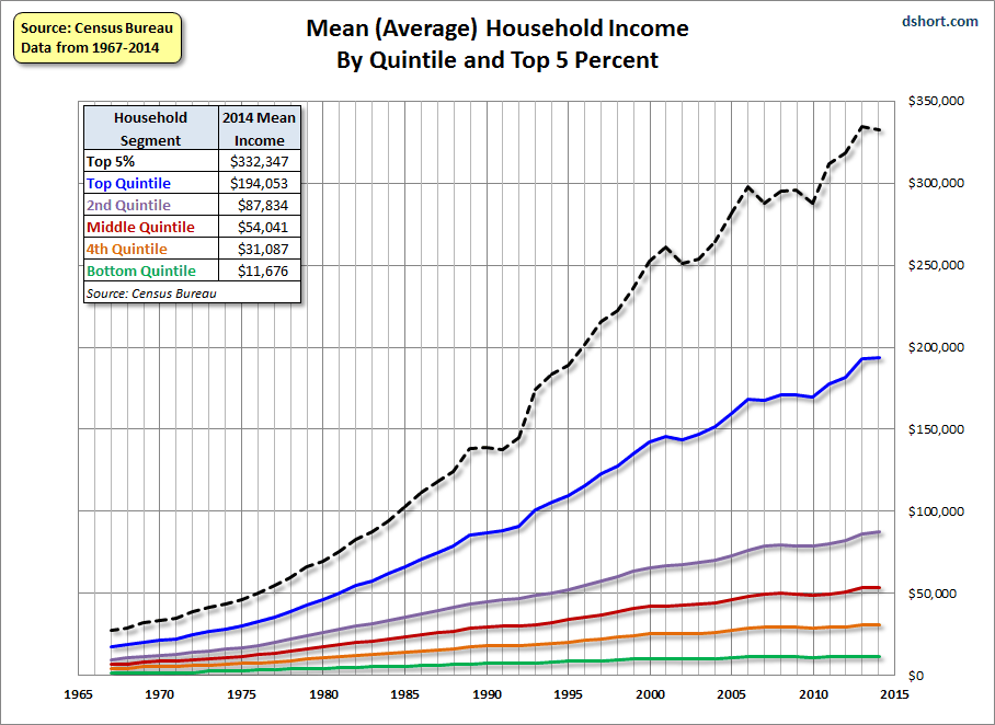
The Census Bureau has now released its annual report household income data for 2014. It is posted on the Census Bureau website. What we’re featuring in this update is an analysis of the quintile breakdown of data from 1967 through 2014 (see Table H.3).
Most people think in nominal terms, so the first chart below illustrates the current dollar values across the 47-year period (in other words, the value of a dollar at the time received — not adjusted for inflation). What we see are the nominal quintile growth patterns over the complete data series. In addition to the quintiles, the Census Bureau publishes the income for the top five percent of households.
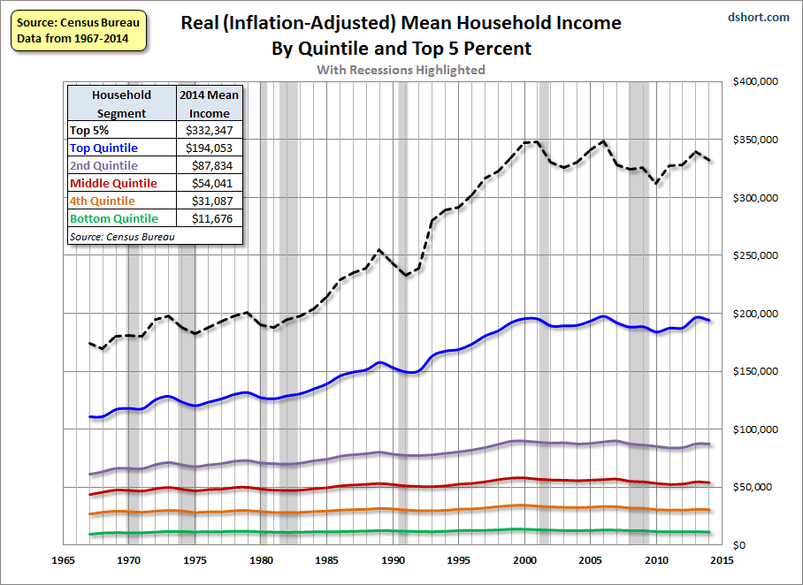
The next chart adjusts for inflation in chained 2014 dollars based on a research variant of the Consumer Price Index, the CPI-U-RS. In other words, the incomes in earlier years have been adjusted upward to the purchasing power of the most recent year in the series. We’ve also highlighted recessions to show the correlation of household incomes to the business cycle.
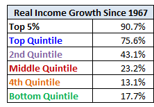
As for the cumulative household income growth by segment over the past 47 years, the adjacent table shows the real, inflation-adjusted, difference between 1967 and 2014.
To give us a better idea of the underlying trends in household incomes, we’ve also prepared charts of the nominal and real percentage growth since 1967. Here is the real version. Note in particular the growing spread between the top quintile (and especially the top 5%) and the other four quintiles.
real
Here is a table showing decline in income for each household segment from its real peak.
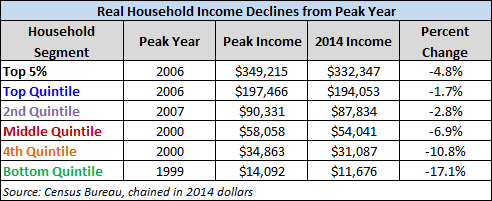
This table clearly illustrates a key explanation for the prolonged weakness in the consumer and small business confidence indicators we track:
- Michigan Consumer Sentiment Index
- Conference Board Consumer Confidence Index
- Small Business Optimism Index
For example, here is the Michigan Consumer Sentiment Index:


Leave A Comment