Okay, so the theme is that on the macro 3 events may come together to signal a big climax, leading to change.

Those Amigos are…
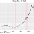
We use the big picture graphic (a bit dated now) for cartoonish illustration purposes. This shows global and US stocks retracing the former bear market vs. gold, the 30yr yield Continuum™ and the yield curve.

Today, let’s take a daily view of stocks vs. gold and update the big pictures of the others.
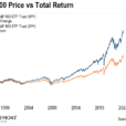
SPY vs. GLD is taking the next step higher. Referring to the big picture graphic above, this could be the final and terminal launch to the projected resistance area. Warning to all you real time thinkers: the process could move slower than your brain waves. Have patience.

The next Amigo is long-term bond yields. The 10yr held the 50 and 200 day moving averages.

The 30yr is more suspect, but the pattern’s symmetry is still in play.

Here’s the Continuum™, AKA the 30yr bond yield and its 100 month exponential moving average limiter. It continues to flash a bull flag and the pattern above would measure to the limiter around 3.3% if it becomes active.

Here is the daily view of the yield curve. It is burrowing downward, chronically flattening but not yet near inverted.

Here’s the bigger picture view complete with my editorial markups about the bond/yield curve manipulation scheme secretary Mnuchin is cooking up in a ‘me too!’ play to the brilliantly evil Operation Twist that was inflicted upon free markets by the Bernanke Fed in 2011. Here is the post from November 20 in which we highlighted the details of the scheme.

Bottom Line
The 3 Amigos of macro change will ride until they hit the wall known as the limitations of a cooked up macro market backdrop. If – and it’s of course still a question – stocks retrace vs. gold, yields rise and the yield curve flattens toward logical limit points, and these limits come about in confluence, it could be the biggest market signal (of drastic changes) many of us have received in our lifetimes. And I don’t see that as hyperbole.


Leave A Comment