
An Update in Light of Recent Data Releases
Since our last updates on the manufacturing sector of the US economy (in chronological order: “Is the US Economy Close to a Bust?” and “More Ominous Data Points”), new data have been released and our friend Michael Pollaro has mailed us updated versions of his charts, so we decided to provide another update. So far, there is no sign that the emerging downtrend in manufacturing activity is stopping or reversing. The recent manufacturing ISM has barely clung on to the 50 level, but this masks quite a bit of underlying deterioration.

In light of this, it is also noteworthy that the trend in business sales and orders is diverging ever more strongly from the stock market’s trend. The deterioration in economic activity is evindently masked by the inflationary policies instituted all over the world. Experience suggests that this divergence will end and that these trends will eventually become synchronized again. Given the growing gap, the eventual reassessment could be unpleasantly violent (we did get another warning shot this summer). This is however not completely independent of central bank actions. The cries for even more lunatic money printing exercises are becoming ever louder, which we plan to discuss in a separate article. In the meantime on to the charts. The first three charts are the updates Michael sent us:
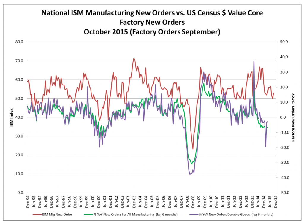
ISM new manufacturing orders vs. the y/y percentage change in new orders for all manufacturing and new orders for durable goods, lagged by 6 months.
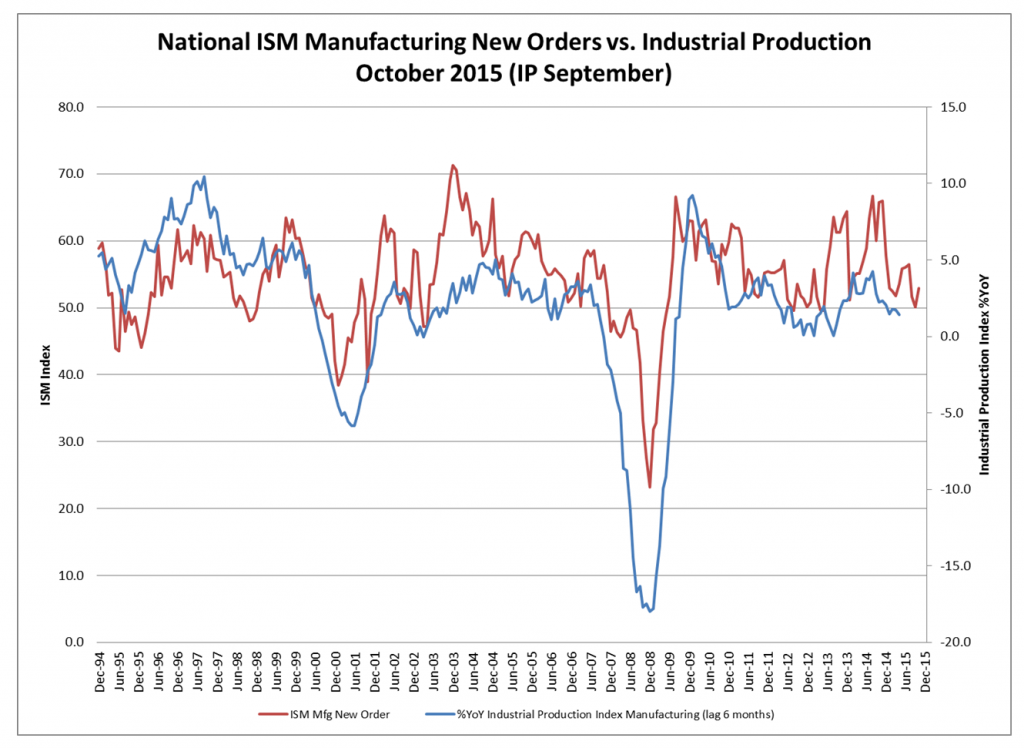
ISM new orders vs. Industrial production index for manufacturing (lagged by 6 months.
The “money chart” – both figuratively and literally – is the one depicting the growth in the actual dollar value of factory orders and unfilled orders for non-defense capital goods (ex aircraft).
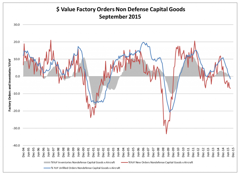
Annual change rate in the dollar value of factory orders and unfilled orders for non-defense capital goods ex aircraft (plus change in inventories, gray area).


Leave A Comment