The Great Recession ended more than eight years ago, in June 2009. The US unemployment rate declined slowly after that, but it has now been below 5.0% every month for more than two years, since September 2015. Thus, an ongoing mystery for the US economy is: Why haven’t wages started to rise more quickly as the labor market conditions improved? Jay Shambaugh, Ryan Nunn, Patrick Liu, and Greg Nantz provide some factual background to address this question in “Thirteen Facts about Wage Growth,” written for the Hamilton Project at the Brookings Institution (September 2017). The second part of the report addresses the question: “How Strong Has Wage Growth Been since the Great Recession?”
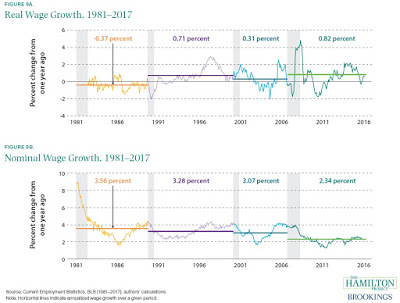
For me, one surprising insight from the report is that real wage growth–that is, wage growth adjusted for inflation–has actually not been particularly slow during the most recent upswing. The upper panel of this figure shows real wage growth since the early 1980s. The horizontal lines show the growth of wages after each recession. The real wage growth in the last few years is actually higher. The bottom panel shows nominal wage growth, with inflation included. By that measure, wage growth in recent years is lower than after the last few recessions. Thus, I suspect that one reason behind the perception of slow wage growth is that many people are focused on nominal rather than on real wages.

Government statistics offer a lot of ways of measuring wage growth. The graphs above are wage growth for “real average hourly earnings for production and nonsupervisory workers,” which is about 100 million of the 150 million workers.
An alternative and broader approach looks what is called the Employment Cost Index, which is based on a National Compensation Survey of employers. To adjust for inflation, I use the measure of inflation called the Personal Consumption Expenditures price index, which is the inflation just for the personal consumption part of the economy that is presumably most relevant to workers. I also use the version of this index that strips out jumps in energy and food prices. This is the measure of the inflation rate that the Federal Reserve actually focuses on.
Economists using these measures were pointing out a couple of years ago that real wages seemed to be on the rise. The blue line shows the annual change in wages and salaries for all civilian workers, using the ECI, while the red line shows the PCE measure of inflation. The gap between the two is the real gain in wages, which you can see started to emerge in 2015.


Leave A Comment