
How much, and on what, does the average American household spend each year? And how has that changed over time?
The Consumer Expenditure Survey (CEX) for 2017 has been released, which provides the answers to these questions for each year from 1984 through 2017! Produced as a joint product of the U.S. Bureau of Labor Statistics and the U.S. Census Bureau, the CEX compiles the information collected through tens of thousands of surveys, diaries and interviews with by U.S. households, or “consumer units” as the BLS’ data jocks affectionately calls them, which provides a tremendous amount of insight into how they allocate their limited resources.
That data isn’t just filed away. The results of each year’s CEX are used to determine how to set the relative weightings of different types of expenditures within the Bureau of Labor Statistics’ Consumer Price Index, which is used to estimate the rate of inflation in the U.S. economy.
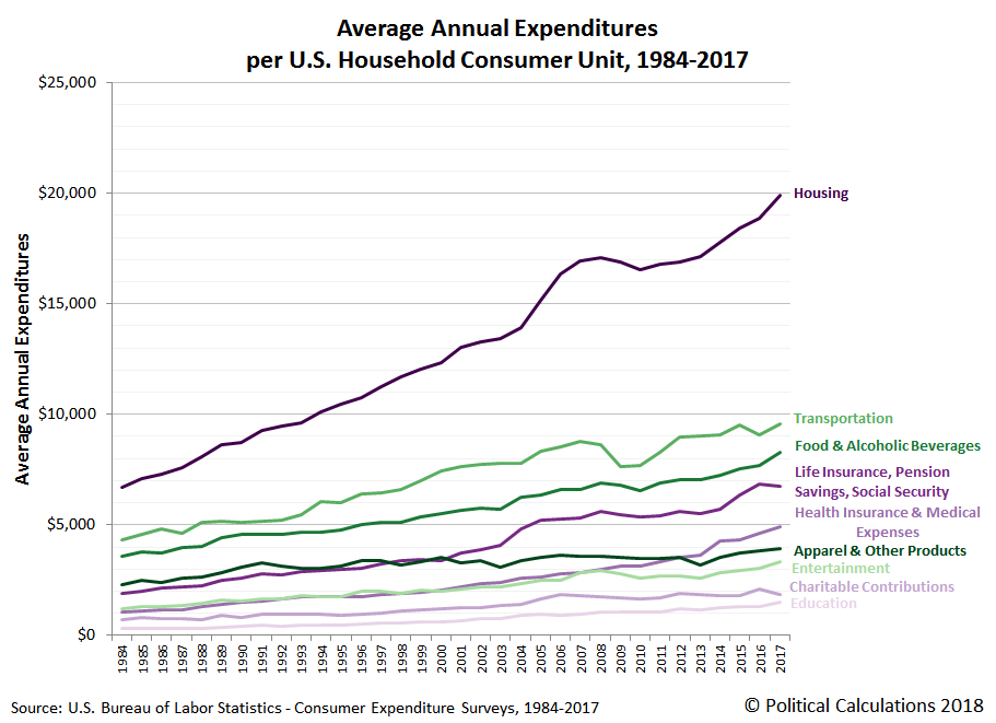
With that introduction now out of the way, let’s visualize the major categories of U.S. household expenditures for each year from 1984 through 2017. The following chart shows the average amount that some 130 million American household consumer units have collectively spent on things like housing, transportation, food, financial products, health care, clothing, entertainment, charitable contributions, and education.
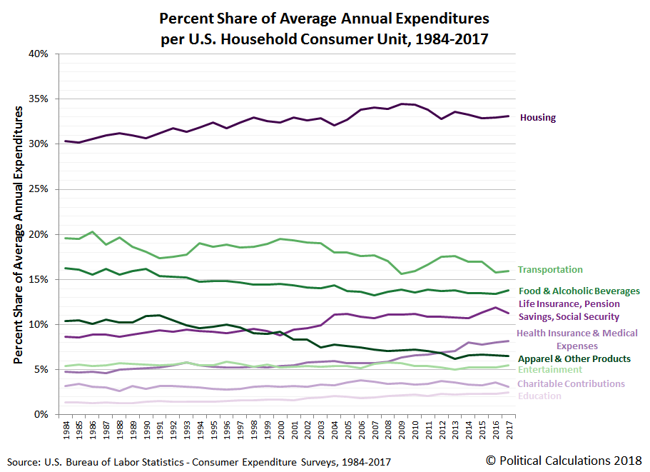
In the next chart, we show all those same expenditures, but this time as a percent of the average annual expenditures of a U.S. household/consumer unit:
Finally, we’ll present an update to one of our favorite charts that we’ve ever made showing how all these expenditures fit together as a percentage share of all expenditures. Here, the expenditures shown on the bottom of the chart (in shades of purple) show those expenditures whose share among the total has increased over time, while the expenditures shown toward the top of the chart (in shades of green) show the household expenses shose share has fallen.


Leave A Comment