

During the month of January, we were submerged by a wave of financial results. I truly appreciate earnings season as it gives me the true color of what is really going on out there. However, we don’t all understand financial results the same way. Two companies are currently heading toward very different trends. Take a look at this: I am not going to tell you which one is which, just for the sake of the exercise.
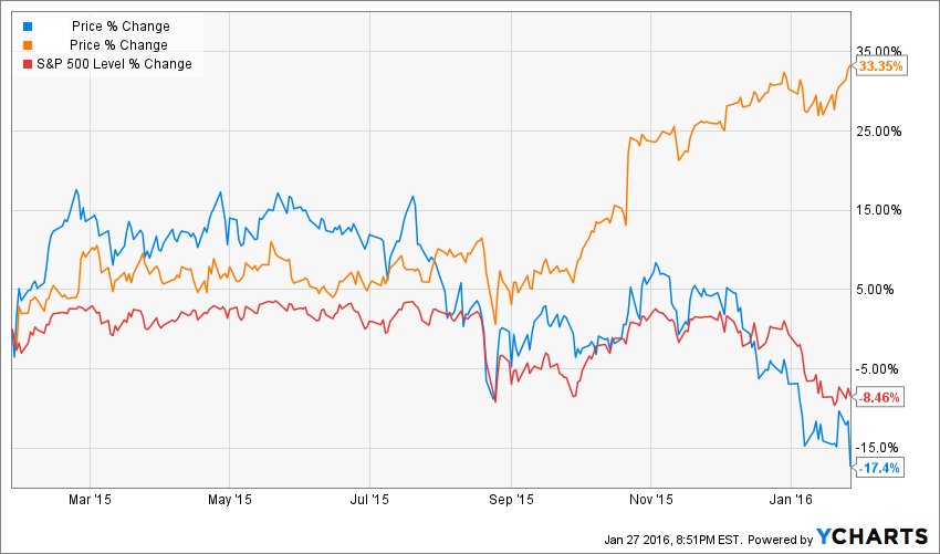
As you can see, one clearly beat the S&P 500 over the past 12 months and the other one is seriously trailing behind. For the record; both companies are leaders in their industry and are paying dividends. Let’s try to understand by looking at each company’s fundamentals why there is so much love for one company and so much hate for the other one.
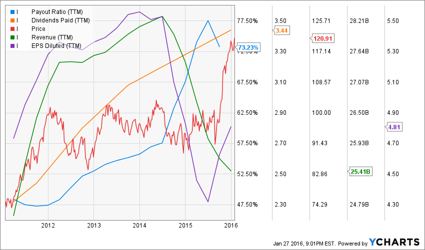
A closer look at the “Loved One”
The first company shows the following metrics for the past 5 years:
5 year revenue growth: 1.09%
5 year earnings growth: 1.48%
5 year of dividend growth: 8.77%
Current dividend yield: 2.85%
Payout ratio: 73.23%
Cash payout ratio: 69.23%
PE ratio: 25.14
At first, it doesn’t look like a superpowered dividend growth stock to me. While the 5 year dividend growth rate is very interesting, you can tell that with a payout ratio near 75% and both anemic revenue and earnings growth over the past 5 years, there is the beginning of a problem here. It doesn’t get any better when you look at the 5 year trends:
A closer look at the “Hated One”:
The hated company shows the following metrics for the past 5 years:
5 year revenue growth: 29.08%
5 year earnings growth: 33.61%
3 year of dividend growth: 73.58%
Current dividend yield: 2.17%
Payout ratio: 21.65%
Cash payout ratio: 16.57%
PE ratio: 10.16
Hum… this is getting interesting. As you can see, the second company is showing stellar numbers. In fact, it’s almost too good to be true! Please note that the company has been paying dividends for only 3 years though… but still the 5 year metrics trends looks very good:


Leave A Comment