Last week I put the finishing touches on the 2017 End of Year Special Edition of the Weekly Macro Themes report – something which is fast becoming a tradition here! The report brought together the charts that worked (as well as those that didn’t!), some honorable mentions, the ones to watch in 2018, a few fun charts at the end, and of course – the topic of this blog post – my favorite charts of 2017. These are my favorites for a few reasons, they might have been about a critical issue or may have simply been a new way of looking at something. Anyway, I hope you enjoy them, and be sure to check out the report (which is being made available as a one-off free download to my followers).
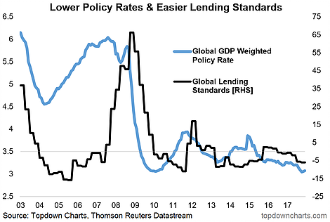
1. Global lending standards and the global GDP weighted monetary policy rate (3 Nov 2017) “However one reason for optimism is the point that global (DM focused) lending standards remain easier and at an aggregate level monetary policy rates remain low.”
>> I like this one because it brings in 2 really key gauges of global monetary policy settings and financial conditions, and provides a unique view.

2. Tax takes and GDP growth (10 Feb 2017) “While there are many factors at play, the rise of general government receipts as a % of GDP could be a contributing factor to the slowing of GDP growth through time for OECD countries.”
>> I like this one because, while only one factor, it’s fairly intuitive and a relatively clear link.

3. Retail investor cash allocations – about as low as it gets [signs of capitulation buying] (2 Jun 2017)
>> I like this one because it shows just how stark the exodus from cash has been; some of the exodus has been to bonds (to get more income) but mostly it’s to stocks by active reallocation and market driven drift.Again, at the time it was a unique view – you saw it here first!


Leave A Comment