
This post will outline how the U.S. Major Indices, Major Sectors, S&P 500 Index and the SPX:VIX Ratio performed throughout 2017 and how they ended the year.
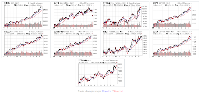
U.S. Major Indices
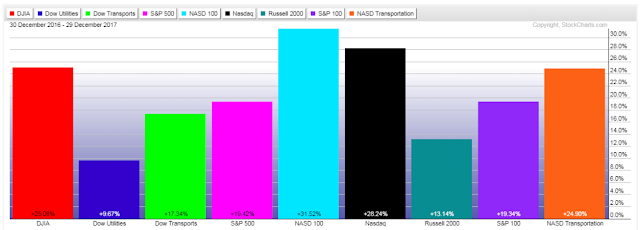
The following 1-year daily charts and year-to-date percentage-gained/lost graph show that all Major Indices, except Utilities, are trading well above their 50-day moving average, and that Technology made the most gains, followed by Transports, Large-Caps, Small Caps, and, Utilities.
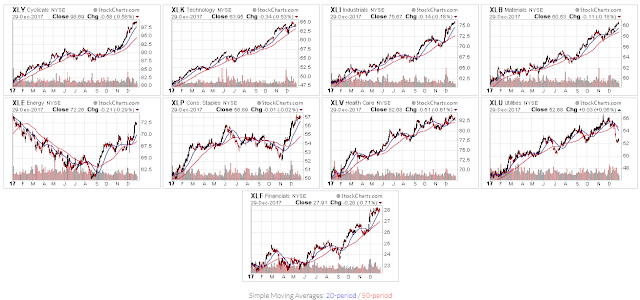
Major sectors
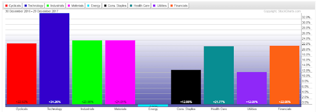
The following 1-year daily charts and year-to-date percentage-gained/lost graph show that all Major Sectors, except Utilities, are also trading above their 50-day moving average, and that Technology gained the most, followed by Materials, Industrials, Consumer Cyclicals, Financials, Health Care, Consumer Staples and Utilities, while Energy ended, essentially, flat, at -0.89%.
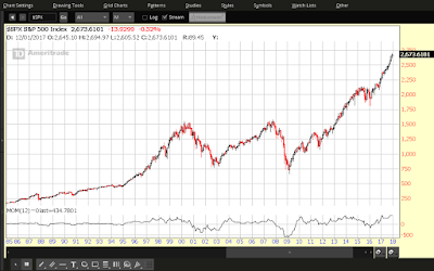
S&P 500 INDEX
The following four charts of the S&P 500 Index will depict how 2017 ended, on a yearly, quarterly, monthly, and weekly basis.
Each candle on the following chart represents a period of one year.
2017 extended gains made in 2016, mostly remained above 2250, and finished the year on an extremely bullish candle. Momentum hit an all-time high on this timeframe by year-end.
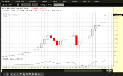
Each candle on the following chart represents a period of one quarter.
Each of the four 2017 quarters gained on the prior one, without much of a pullback in each. Momentum has yet to make a new swing high on this timeframe since it peaked in 2014.
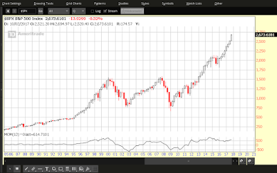
Each candle on the following chart represents a period of one month.
With the exception of March, each candle closed higher, with a bit more candle overlap. Momentum also closed out the year at an all-time high on this timeframe.
Each candle on the following chart represents a period of one week.
There are several minor pullbacks evident throughout 2017 and some profits were taken in the last two weeks. Momentum dipped a couple of times, but remained above zero, and ended in a strong uptrend.


Leave A Comment