
Mark Hulbert recently penned a very good article discussing the “Eight Best Predictors Of The Stock Market,” to wit:
“The stock market’s return over the next decade is likely to be well below historical norms.
That is the unanimous conclusion of eight stock-market indicators with what I consider the most impressive track records over the past six decades. The only real difference between them is the extent of their bearishness.
To illustrate the bearish story told by each of these indicators, consider the projected 10-year returns to which these indicators’ current levels translate. The most bearish projection of any of them was that the S&P 500 would produce a 10-year total return of 3.9 percentage points annualized below inflation. The most bullish was 3.6 points above inflation.
The most accurate of the indicators I studied was created by the anonymous author of the blog Philosophical Economics. It is now as bearish as it was right before the 2008 financial crisis, projecting an inflation-adjusted S&P 500 total return of just 0.8 percentage point above inflation. Ten-year Treasuries can promise you that return with far less risk.”
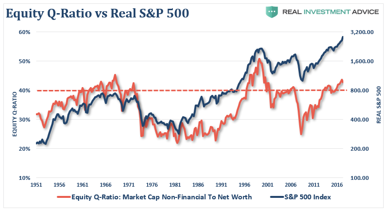
Here is one of the eight indicators, a chart of Livermore’s Equity-Q Ratio which is essentially household’s equity allocation to net worth:
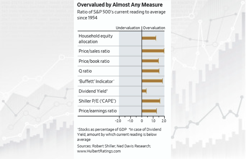
The other seven are as follows:
As Hulbert states:
“According to various tests of statistical significance, each of these indicators’ track records is significant at the 95% confidence level that statisticians often use when assessing whether a pattern is genuine.
However, the differences between the R-squared of the top four or five indicators I studied probably aren’t statistically significant, I was told by Prof. Shiller. That means you’re overreaching if you argue that you should pay more attention to, say, the average household equity allocation than the price/sales ratio.”
As I discussed in “Valuation Measures and Forward Returns:”
“No matter, how many valuation measures I use, the message remains the same. From current valuation levels, the expected rate of return for investors over the next decade will be low.”
This is shown in the chart below, courtesy of Michael Lebowitz, which shows the standard deviation from the long-term mean of the “Buffett Indicator,” or market capitalization to GDP, Tobin’s Q, and Shiller’s CAPE compared to forward real total returns over the next 10-years. Michael will go into more detail on this graph and what it means for asset allocation in the coming weeks.


Leave A Comment