
Here is the updated weekly (BTK) chart we have used over the last several months to gauge a speculative leader. Not only did BTK hold up well through 2014?s two moderate corrections, but it also broke channel lines in favor of an arc curving upward. Key support is highlighted.
Click on picture to enlarge
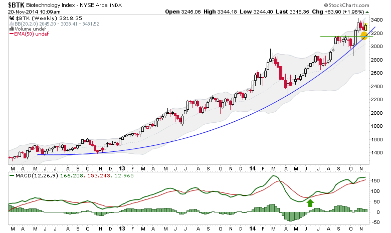
Charts like this juxtaposed against several indicators that are in warning mode make the market interesting, but also complicated. With a momo like BTK doing this while other parts of the market lag and indicators diverge bearishly, one wonders if the play may well be an upside blow prior to a real correction (unlike this aborted little things we’ve had so far in 2014).
It would be incredibly unhealthy for example to see a Santa/Wall Street bonus season blow off and public suck in amidst fading junk-quality bond spreads, fading participation and ramping ‘dumb money’ bullishness.
Those are the kind of thoughts I have when I view the likes of the bullish BTK chart against so many other data points.


Leave A Comment