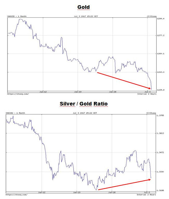
Look at these two charts:

Source: stooq.com
It happens all the time – there is another divergence (red arrows) between gold prices (the upper panel of the chart) and the silver/gold ratio (the lower panel of the chart).
Generally, when gold prices are diving and the silver/gold ratio is going up, the precious metals market is close to its local bottom.


Leave A Comment