It’s become readily apparent to me lately that retail investors do not appreciate the extent to which the returns they’ve enjoyed since 2009 are directly attributable to central bank largesse.
Normally, we could just write that off as harmless naiveté, but at this point it’s dangerous. Most investors have no conception whatsoever of the extent to which their performance is in no way, shape, or form a product of their own acumen but rather an inevitable consequence of the rising central bank tide that’s lifted all boats.
This will end in (a shit load) of tears when the punch bowl is pulled away and suddenly, every newsletter purveyor and home gamer-turned-self-described-guru discovers that this was all an illusion.
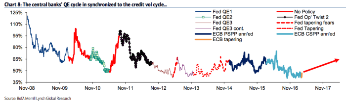
Well, in an effort to drive that point home, here’s a chart from BofAML which should (and I emphasize “should” because at least half of the people who read this still won’t get it) be an idiot-proof visualization of exactly what’s going on here.
This is credit implied vols annotated with colors (basically) to indicate periods of central bank intervention and periods where they’ve stepped away.

Here’s BofAML to explain that for anyone who still doesn’t understand:
Global monetary policies (tightening or expanding) have a profound impact on the credit implied vol market. Chart 8 clearly illustrates this phenomenon. Every time the Fed embarked on the different phases of its QE programme, credit implied vols declined materially. On the other hand, during periods of no policy or when the market started pricing the possibility of policy removal (tapering tantrum and the subsequent tapering phase) implied vols advanced.
Got it?
Good.


Leave A Comment