Last week, we discussed the ongoing fall of dividend, and especially earnings, yields. This Report is not a stock letter, and we make no stock market predictions. We talk about this phenomenon to make a different point. The discount rate has fallen to a very low level indeed.
Discount in stocks is how you assess the present-day value of earnings to occur in the future. For example, if the discount rate is 10%, then a dollar of earnings per share at Acme Piping next year is worth $0.90 today. At a 1% discount, it’s worth $0.99. As you look forward many years, the difference between these rates is very large.
A buck of earnings at 10% discount = $1.00 + $0.90 + $0.81 + $0.73 … = $10.
At 1% discount = $1.00 + $0.99 + $0.98 + $0.97 … = $100.
A rising stock price is equivalent to a falling discount rate, assuming earnings are not growing commensurately. Our graph last week shows that they aren’t.
The idea of commensurate is important in economics. Any economist can paint a rosy picture by, for example, showing rising GDP. If you object that debt is rising with GDP, the economist switches to a chart of debt/GDP. He will tell you that the solution is to grow GDP with the right fiscal and regulatory policies.
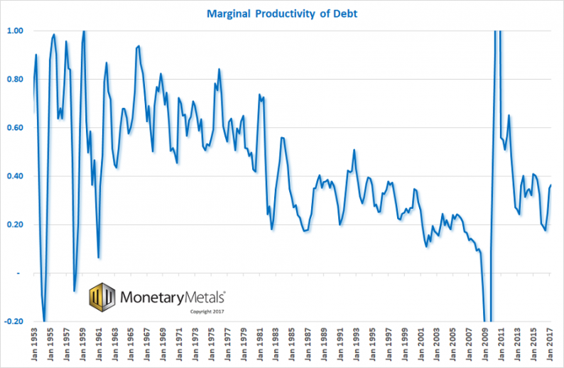
However, we can look at how much additional GDP is added for each newly-borrowed dollar. This is called marginal productivity of debt. This shows a clear picture, a secular decline over many decades. To produce this graph, take change in GDP divided by change in debt.

Source: St Louis Fed
Several salient features stand out. One is the volatility in the early years of the series. Without digging deeper into this, we suspect this is at least partly due to errors in how the data is gathered.
Two, the oscillations are the Federal Reserve’s business cycle! There is a peak every few years. If you picture a bureaucrat moving levers to control the economy, trying to boost at times, but not overcompensate, that’s not far off the mark.
Three, this is a long-term falling trend. Everyone has seen graphs showing GDP growing. In fact, GDP is now 50 times greater than it was 65 years ago, at the start of the graph in 1947. However, debt has also been growing. GDP is not growing commensurately with debt. It is underperforming. Just a little bit each year, but over time it is profound.
Up until around 1981 (an important date, as this is when the rising interest rate turned to falling—more on that below), the peaks were well over 70 cents of growth for every dollar borrowed. This is not good, by the way—it should be over a dollar. But it’s a damned sight better than what happened after that.
From 1981 through just prior to the global financial crisis, marginal productivity of debt fell from over 70 cents to under a dime. A freshly borrowed dollar added less than 10 cents to the economy (by the way, we think GDP is a flawed measure of the economy, in the same way that the amount someone eats is a flawed measure of his wealth). Less than 10 cents on the dollar of borrowed money went into all the things included in GDP. That means that more than 90 cents went into something else.


Leave A Comment