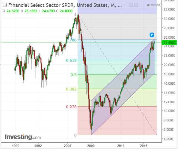
The following Monthly chart of XLF shows that current price is up against major long-term Fibonacci, channel and price resistance.

The Daily ratio chart below of XLF:SPX also shows that price is up against major short-term price resistance.

The year-to-date percentages-gained graph below shows that XLF has been holding its own, so far this year, compared with the other 8 Major Sectors.
We’ll see if 25.00 can be overcome and held (to potentially propel it to 30.00, or higher), or whether traders get cold feet on this ETF in the near term.


Leave A Comment