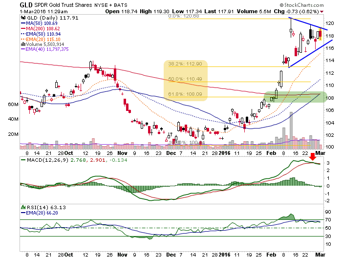
Using the ETFs, we find gold in the nose of what would normally be thought of as a bullish Triangle (continuation) pattern.

However, we’ll note here what NFTRH has been noting for subscribers; risk vs. reward has risen markedly. This is illustrated in the CoT data below and anecdotally all around the financial internet where gold has taken a starring role in 2016. So, in the event that the Symmetrical Triangle resolves bearish we note the favored pullback area at around 109 (1130 +/- on gold), a 62% Fib retrace and the 50 and 200 day moving averages.

Probably my best indicator on this has nothing to do with risk ‘off’ gold. It has to do with the risk ‘on’ stock market, which targets higher on the relief bounce. It makes sense that the two would oppose each other. Right minded gold bugs should want that to be the case. But again, we have been in a caution mode since silver’s CoT hit the transition zone a couple weeks ago. Gold just entered it last week.
Silver (SLV) began to get brutalized on Friday and with the CoT it was sporting, it should have. Now it appears to be forming a bear flag at a little way station called the EMA 50. The problem in expecting a nice, neat 62% pullback here is that there is a little support at the 62% Fib, but these are precious metals (i.e. volatile). Expect that the denser support zone can be hit or even penetrated.

As for the ratio, this is curious as the Gold-Silver ratio continues upward. Normally this would not be the case when broad asset markets are rallying. As it stands now it is a negative divergence on the fly to the stock market’s bounce; a bounce we fully anticipated and prepared for. Since I do not control the markets, I’ll stand ready to alter plans as needed. But for now, the rising GSR puts a shelf life on the market rally.


Leave A Comment