When I first shared this chart I thought it was kind of interesting to see leveraged long ETF assets surge in the lead up to the market peak in January, and stay resilient throughout the heightened market volatility. Fast forward a few months and assets under management in leveraged long (combines 2x and 3x) US equity ETF AUM have only continued to climb as investors (speculators?) double down on bullish bets… at the same time we see leveraged short funds losing assets – which you would tend to expect as the S&P500 has moved on to new highs.
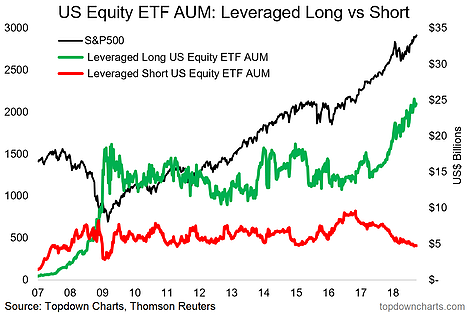
I suppose it goes to show that when it comes to these leveraged bets, investors are invariably going to find themselves overexposed on the long side and underexposed on the short side going into any correction that may come.
And while you could be tempted to say that this chart basically shows investors going “all-in”, it’s only a relatively small corner of the market, with leveraged long AUM around $25B and short $5B – which is barely a fart in the wind when you compare it against the S&P500 total market cap of almost $25 Trillion…
BUT – there is a chart which shows investors basically going “all-in”.
This one: investor asset allocations (to cash) across 3 different measurements (with 1 conclusion).
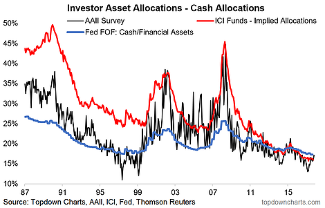
Cash allocations have fallen to either a record low, a cycle low, or the lowest point since the dot-com bubble (depending which metric you look at)…cash allocations are at rock bottom.
For clarity, the AAII (black line) is a surveyed measure of investor portfolio allocations to cash, the ICI implied allocations (red line) is calculated based on total funds under management in America (hence, “implied allocation”, or market share of cash funds), and the Fed FOF (blue line) is calculated from the US Federal Reserve’s flow of funds report – which gives basically the average portfolio allocation to cash across all US households. They all basically agree, certainly at least the cycle, and trend.


Leave A Comment