
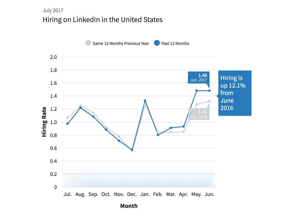
The chart below supports my point that the ADP private sector payrolls report was too negative on the labor market. As you can see in the chart below, the LinkedIn (LNKD) hiring rate in June is up 12.1% year over year as it remains at the highest level in the past 24 months. The past two months have seen an acceleration in hiring growth after the index had been tracking the previous year’s results almost perfectly. There aren’t any other major metrics which signal the labor market is as weak as the June ADP report showed. Using recent labor reports doesn’t predict intermediate term results (12-24 months), but it does imply that the next few months will probably be fine. There would have to be a catalyst to break the trend.
This past week’s jobless claims also supports the narrative that the labor market is strong as it fell from 250,000 to 247,000. It fell for the first time in a month. The only trend in that indicator is stability. Obviously, stability comes first before an increase, but don’t be quick to assume an increase is coming soon. It can easily stay below 275,000 for another few months. I am learning from a prior failed prediction where I said the jobless claims would get above 300,000 in the summer of 2016. I’m expecting my initial guess to be 2 years off.
I love when charts prove a prior narrative false. Investing is difficult when you have all the facts, but it’s impossible when you are operating on false pretenses. The chart below shows how the metric of the number hours it takes for the average non-supervisor worker to buy the S&P 500 is a bogus stat. The blue line shows that incorrect calculation. The orange line shows the correct way to look at this metric as it uses real S&P 500 earnings. The blue line doesn’t calculate what you’re getting when you buy the S&P 500, making it useless. I have previously used the blue line to show how the market is overvalued. I stand corrected as I didn’t consider how the calculation ignored real earnings.


Leave A Comment