
In yesterday’s alert we wrote that the reversal in the precious metals market should once again not be taken at its face value and that one should not overreact based on it as the size of the potential rally was limited. Well, it turned out that “limited rally” was an euphemism for a decline. Gold, silver and mining stocks declined once again despite the previous day’s reversal and gold stocks confirmed the breakdown below the key support line. The implications are strongly bearish. However, there’s something ever more bearish and much more profound.
Let’s recall the situation in silver. A few weeks ago we wrote about silver’s move to the key resistance line and the huge importance of the invalidation of the breakdown below the line based on the weekly closing prices. Silver is now significantly below the resistance line, but the key question is if the decline is already over. Well, it seems that it’s far from being over and the analogy that we are going to discuss shows just how far it could be from being over.
History repeats itself – maybe not to the letter, but more or less – that’s the key principle of technical analysis. This principle is usually utilized by using chart patterns, but it goes beyond this – to self-similarity and fractal analysis. Long story short, if one manages to find a pattern that is a good reflection of a pattern from the past (either direct or on a proportional basis) then they could profit on the pattern’s continuation.
Based on the above paragraph and the title of this article, you may already suspect that there is a very important self-similar pattern in silver. Let’s take a closer look (charts courtesy of StockCharts).
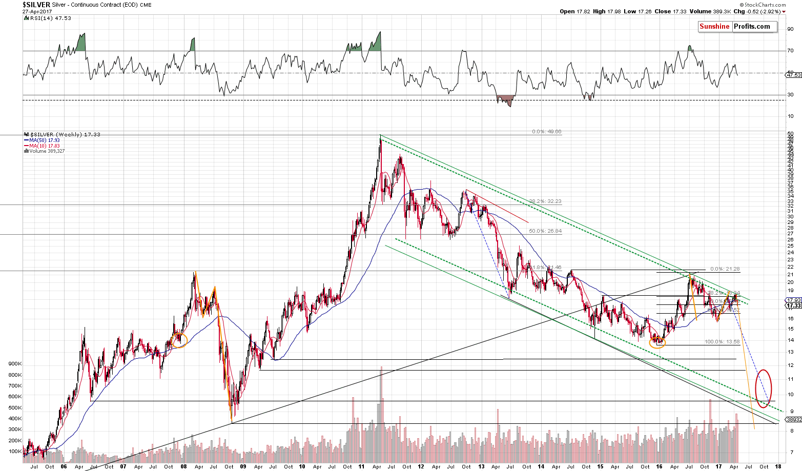
Please focus on the parts of the chart that we marked with orange (in 2016-2017 and in 2007-2008). At first sight there’s nothing similar between what had happened in late 2007 and the first half of 2008 and what’s been taking place since December 2015. However, the more one starts to compare them, the more amazing it becomes.


Leave A Comment