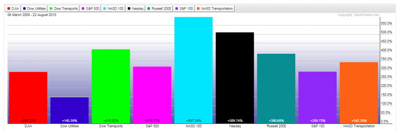
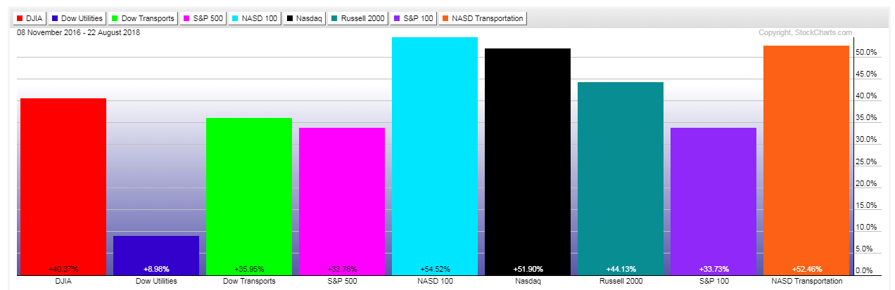
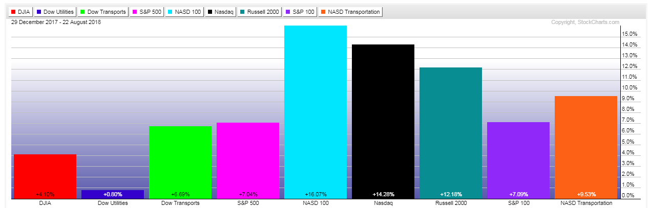
The first three of the following graphs depict percentages gained for the Major U.S. Indices during three time periods, namely:
Generally, traders/investors have favored technology, small-cap, and transportation indices over the large-cap and utilities indices…indicating a stronger preference for risk over value, which continues to today.

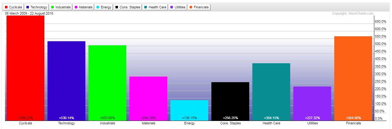
The next three graphs depict percentages gained for the nine U.S. Major Sectors:
Until this year, traders/investors have favored consumer cyclicals, technology, industrials, health care, and financials. However, this year, industrials and financials have fallen out of favor, leaving only a risk-on environment in consumer cyclicals, technology, and healthcare, while the remaining sectors are roughly flat or underwater, in comparison…indicating a reduced appetite for risk.
As I mentioned in my post of August 15, the U.S. and world financial markets may hold the key as to whether or not this bull market continues to advance for the remainder of the year. Keep an eye on those, along with the USD and other factors mentioned in that article for confirmation, or not, of such a scenario.
As well, watch for any reallocation of money from consumer cyclicals, technology, small caps, and transportation, into large caps, utilities, consumer staples, materials, and energy, if markets shift from a riskier to a more defensive posture.


Leave A Comment