William Bengen calculated sustainable withdrawal rates (SWR) using historical S&P 500 market returns since 1928 leading to the “4% Rule.”[1] More recently, Robert Shiller published stock market returns data back to 1871 using the S&P Composite Index[2]. In this post, I’ll explore the “probability of ruin” using the more extensive Shiller data.
Probability of ruin is typically used in retirement planning to estimate the probability that a retiree will outlive her portfolio based on some set of assumptions such as a fixed planning horizon (often 30 years), market return expectations and a constant-dollar spending strategy. Bengen studied rolling 10-, 20- and 30-year retirements using historical S&P 500 market returns and a constant-dollar spending strategy[3].
He found that assuming a fixed 30-year retirement and annual withdrawals of 4% of the retiree’s portfolio value at retirement the worst-case historical scenario (someone retiring for 30 years beginning in 1966) would have depleted a portfolio in less than 30 years for about 5% of the rolling periods. Hence, the “4% Rule.”
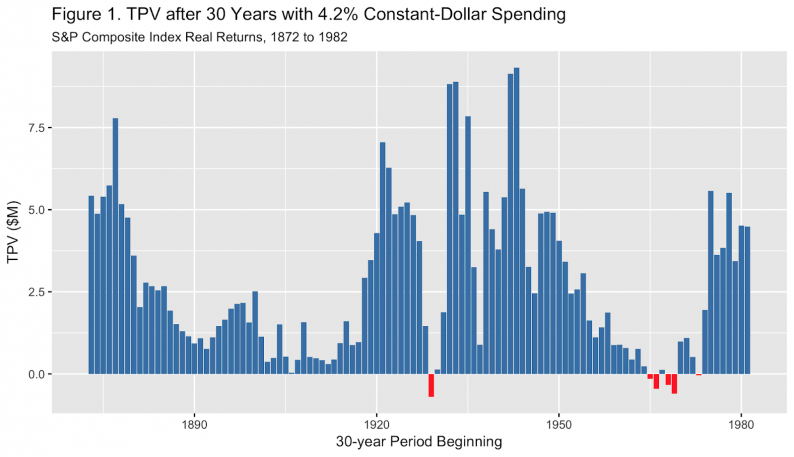
The following chart shows the terminal portfolio value (TPV) after 30 years for a retiree spending $42,000 (4.2%) annually from an initial portfolio valued at $1M for 110 overlapping thirty-year periods from 1872 to 1982. (Shiller’s data ends in 2012 so the last 30-year period began in 1982.) The red bars indicate years of retirement that funded less than 30 years.

Six of the 110 periods (5.5%, the historical “probability of ruin”) were depleted in fewer than 30 years. TPV charts typically and reasonably assume a retiree’s portfolio can’t drop below zero but I continued withdrawals for the full 30 years to show the extent to which they failed. Another way to read this is that the deeper the red column, the sooner the portfolio was depleted.
Take a longing glance at those tall columns, the ones with really large terminal portfolio values. Then, compare them to the little stubby blue guys. Both are probability of ruin “successes”.
Probability of ruin assumes that you’ll be happy simply not retiring in one of those red years. You’re either in the 5% of scenarios that start a losing period or the 95% of winners and so as long as your bar turns out blue, you’re good, right?
Not really. Wouldn’t you be at least a little happier with a tall blue bar than a short, stubby blue bar, even though both avoid portfolio depletion? I would. Probability of ruin assumes that you’ll be just as happy successfully funding retirement and leaving a hundred bucks to your heirs as you would be leaving them a million. And, that you’d be as dissatisfied with a portfolio that funds 29 years as with one that only funds 15.
I wouldn’t. If a planner said, “Hey, great news! Your retirement is funded 95% of the time”, my response would be, “That sounds great but how well does it turn out when it is completely funded and how badly when it isn’t?”
Sequence risk affects all outcomes, sometimes positively and sometimes negatively. Probability of ruin flags only the worst outcomes. Probability of ruin is sort of an upside-down “tip of the iceberg” in that most of the information is hidden from view by condensing all that information into a single data point, the percentage of failures.
(For a better iceberg effect, turn your phone upside down while you view the chart below. If you’re reading this on an iMac or PC, probably better to just use your imagination.)


Leave A Comment