
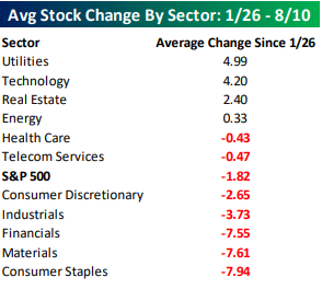
The waiting game for new highs in the S&P 500 continues. Even though the S&P hasn’t moved much at the index level since January 26th, many of its components have seen big moves. The table below summarizes the average performance of individual S&P 500 components grouped according to sector since the 1/26 closing high. Leading the way higher, Utilities has been the best sector with an average gain of just under 5%, but right on the sector’s heels is Technology where stocks are up an average of 4.2%. Besides these two sectors, the only two other sectors where the average stock is up since 1/26 are Real Estate and Energy. To the downside, in three sectors (Consumer Staples, Materials, and Financials), the average stock is down over 7%. That’s quite a big decline given that the S&P is within 2% of record highs.
The chart below shows the return of individual S&P 500 stocks since 1/26 color coded according to sector. Among the 500 individual components in the index, there are a number of big winners and big losers which have each moved over 25%.

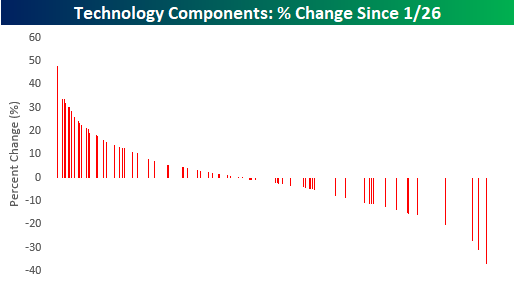
While it nearly impossible to distinguish between each color bar in the chart above, we did it that way for a reason. Below we only show the returns of stocks in the Technology sector from the chart above. Even though Tech hasn’t been the absolute best performer over that period, because of the large number of stocks in the sector and the fact that most of them have seen positive returns, the sector has had a major positive impact.
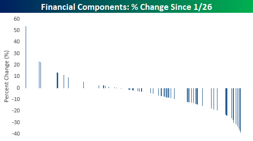
For Financials, it’s the exact opposite. While stocks in the sector are only the third worst in terms of average performance, because there are so many stocks in the sector and they are mostly lower, the Financials have been a major drag.


Leave A Comment