
<< Read More: My Favorite Charts Of 2017
<< Read More: 2017 People’s Choice Charts
This article looks at those in the Honorable Mentions category. Those charts worthy of mention but not quite fitting in the previous categories…
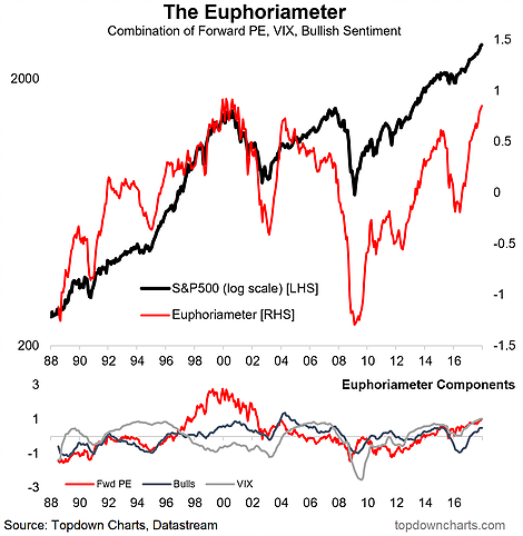
1. “The Euphoriameter” – a holistic composite view of investor sentiment based on survey responses, market risk pricing, and valuations. At present the indicator shows euphoria has become the dominant mood in the market.
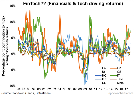
2. What do we want? FinTech! (financials and technology have been the main driver of S&P 500 returns over the past couple of years – the sensationally-inclined might want to call this the “fintech bubble”, but I’ll leave that to others…)
3. The “governance risk premium” – some work we did on expected returns and composite governance rankings appeared to reveal a sort of governance risk premium.

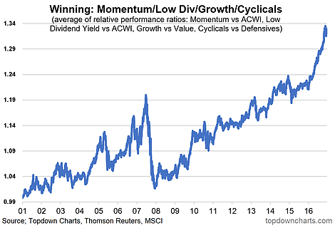
4. It’s all relative… the winners in global equity relative performance are: momentum, low dividend yield, growth vs value, and cyclicals vs defensives. Truly remarkable run-up in the equal weighted index of these factors.
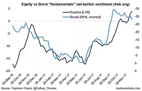
5. Back to the fundamentals: this chart shows an interesting time series. Key point is there has been a massive reassessment of fundamentals on both the equity and bond front (and consistently – note: bonds sentiment is inverted because e.g. better economic fundamentals would be bearish bonds).
6. Final one of this section is an interesting view on rolling realized average pair-wise correlations between the GICS sectors of the S&P 500. It represents a shift away from the “risk-on/risk-off” regime as the various sectors are increasingly doing their own thing. Notably also, it has fallen to levels last seen around the height of the dot com boom. I’ll let you draw your own conclusion on that aspect…


Leave A Comment