
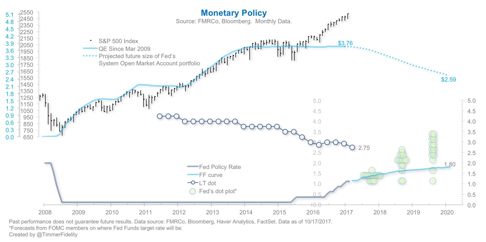
The chart below is a great summary of the monetary policy situation. It shows the S&P 500, the current Fed balance sheet, the future balance sheet, the Fed funds rate, the Fed funds futures, the long term expectations, and the dot plot. Now that stocks have done well for a couple years since the end of QE, I think the calls for a selloff just because QE is over, will end. The new calls for a selloff will occur when the global QE starts to end next year. Don’t be fooled into thinking this policy means a bear market is coming. It’s a possibility, but it needs to be put in context with how the economy is doing, the risk appetite investors have, and where earnings are headed. I’m not saying the balance sheet isn’t important. It’s that no indicator is the absolute truth on where stocks are headed. Many indicators have had a far longer track record of high correlation with the stock market, but that doesn’t mean you just go with what they say. Investing is both an art and a science.
As you can see, the Fed funds curve is very close to the dot plot in the next 12 months. In 2019 and 2020, the dot plot is higher than the Fed funds futures. This shows how the Fed will need to give in to the market by becoming more dovish. The other possibility is inflation picks up which causes the Fed futures to pick up. Also, the Fed could just try to use guidance to move the curve higher. That could potentially flummox the market. However, it’s not that big of a difference unless the Fed plans on going with what its most hawkish members want. As you can see, the decline in inflation has caused the Fed to lower it’s long term projection substantially. The long term rate started to become closer to reality right before the Fed started raising rates. Lowering the long term rate matters more because the Fed is in the hiking cycle. The Fed will probably end the hikes this cycle somewhere between 1.80% and 2.75%.
Where Is The Volatility?


Leave A Comment