
For the benefit of subscribers and to help yours truly to make good decisions, we plot an indicator with ten components on a daily basis, that we refer to as the GDI. On Monday the GDI closed at 39% and on Tuesday it moved into positive territory with a reading at 61%.
Charts courtesy Stockcharts.com unless indicated.
As the following chart (courtesy goldchartsrus.com) shows, the long-term historical pattern (black line), is for gold and mining stocks to rise for 8 months, once the June-July lows are put in place.
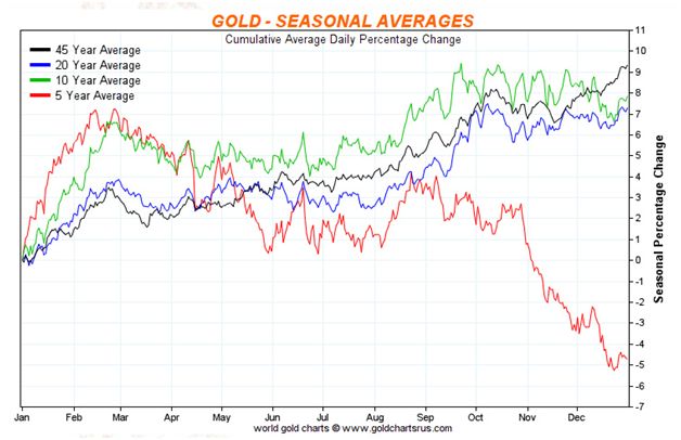
The black line tracks a 45 year average of gold prices.
Another component of the GDI is a chart that compares gold bullion to the US dollar.
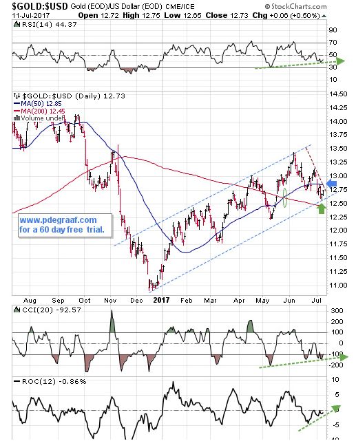
Price carved out an upside reversal on Monday (green arrow), at the bottom of the channel and built on that reversal Tuesday. The supporting indicators are ready to turn positive. The 50-DMA is in positive alignment to the 200-DMA (green oval). Watch for a breakout at the blue arrow that will mark the start of the next wave upwards.
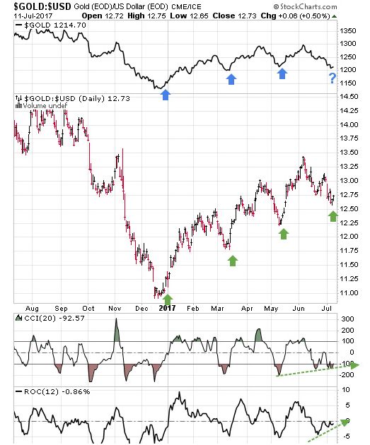
Here is another version of the chart that compares the performance of gold to the US dollar, this time with the gold price at the top. Whenever this index turns up (green arrow) it is usually matched by a turning up in gold (blue arrow).
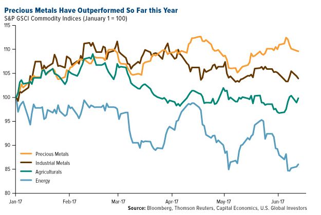
This chart courtesy Frank Holmes at US Global Investors shows Precious Metals have outperformed three other commodity sectors so far this year.
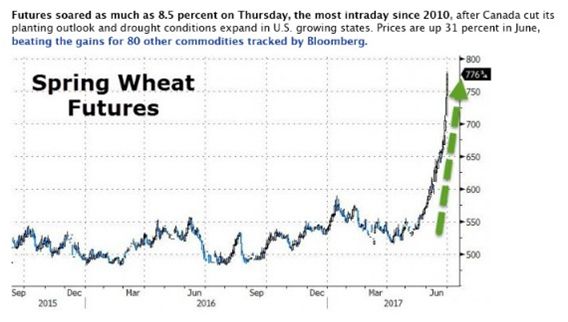
This chart courtesy Zerohedge.com shows a rapid increase in the price of wheat in June, due to drought in the USA, and in Canadian growing areas. This has very inflationary implications (think bread and pizza), and it will have a positive influence on gold and silver, as investors take note of price inflation.
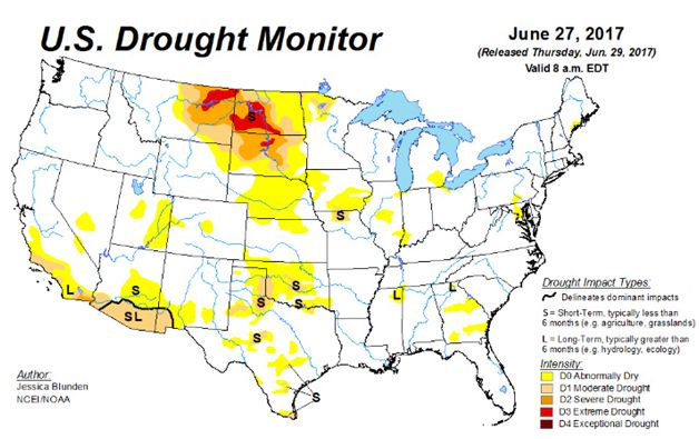
This chart courtesy Droughtmonitor.unl.edu shows areas of the US mid-west where the drought is most severe.
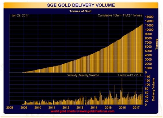
This chart courtesy Goldchartsrus.com shows China’s demand continues to gobble up gold. During the last week in June over 42 tonnes of gold were moved into the hands of Chinese jewelers and investors.


Leave A Comment