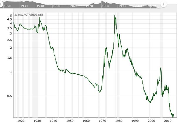
This chart courtesy www.macrotrends.net shows the price of gold compared to the US Monetary Base. The current ratio is at 0.30 and this is the lowest it has ever been. This makes gold the least expensive (compared to the monetary base), in history!

When this index turned up in early 1970, the gold price rose from around $200 to $850. When this index turned up in 2001, the gold price rose from $260 to $1915. Interestingly, this index is once again in the process of turning up. This time it is turning up from the most ‘oversold’ level in history.
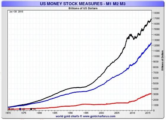
This chart courtesy Nick Laird at Goldchartsrus.com shows money supply in the USA continues to rise exponentially.

Featured is the weekly gold chart. Price is carving out a large bullish falling wedge. The supporting indicators are positive, including the important A/D line. An upside breakout at the blue arrow is just 20.00 away. When this breakout occurs it sets up a target at the green arrow. The rising green channel in the ‘zoom chart’ at right shows the upward progress made since December.

Featured is the gold chart in foreign currencies. Price has been rising since late 2014. The recent breakout above the 200DMA is confirmed by the positive supporting indicators (green lines). This trend is setting the example of what is due to take place in gold as expressed in US dollars. Price is preparing for an upside breakout at the blue arrow. Volume is building (green box), and Tuesday’s volume was the heaviest in 15 months. A breakout at the blue arrow will turn the trend bullish for the first time since late 2014, and likely mark the start of a strong rally.

Featured is an example of gold in Canadian dollars.Price shows a steady rise since December 2014. The moving averages are in positive alignment and rising, (green oval).

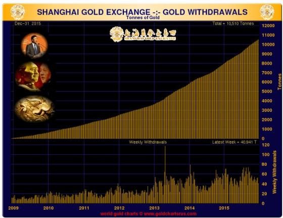
This chart courtesy Nick Laird at Goldchartsrus.com shows withdrawals of physical gold at the SGE continue to mount. This provides bullish fundamental support.


Leave A Comment