
The title is a paraphrase of “the scariest gold chart in the world” (target below $400) someone sent me in 2009, just before the gold price began its $900 per ounce upward journey. So that’s the contrarian caveat and indeed, I hesitate to write bearish things at a time when small speculators are way too short the market and everybody already seems to know how bearish things are.
But the chart is the chart and without further ado, meet the scariest US stock market chart in the world I was ready to try a long on the SPY yesterday, but decided to wait because of this (being posted here because it never made it into NFTRH 381’s already bloated 42 pages) chart and some others in the face of which I just could not rationalize a bullish stance. Capital preservation is job 1 now, not bullish speculation. I’ll let the bulls prove something first.
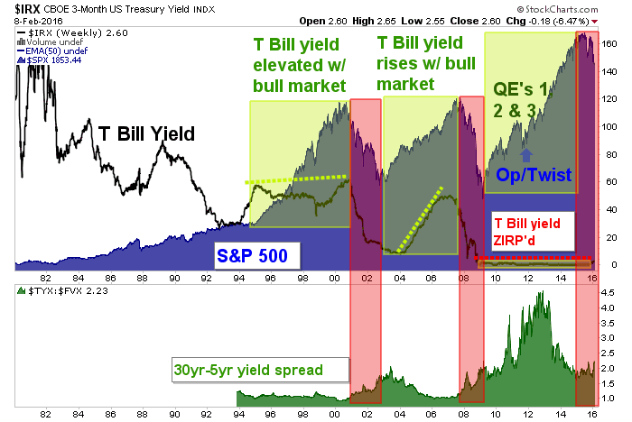
The chart clearly shows what happened to the stock market during the early stages of a 30yr-5yr yield spread upturn. Charts, when presented this way, do not lie*. It’s simply the truth of what happened historically. The last 2 times 30-5 turned up the stock market got croaked. Why? That’s a matter for a long winded post breaking down all the dynamics within the bond market.
This chart is not only bad because of the 30-5/SPX analogs from 2000-2002 and 2007-2009, but also because of the distortion built into the picture by 7 years of ZIRP. The Fed is trying to take back a tiny bit of that unprecedented panic policy and yet the market is vulnerable already, a lousy 1/4 point into the rate hike regime.
So looking beyond any near-term up and down volatility, this picture – for what it is, which is certainly not a comprehensive market view – is about as bearish as it gets, assuming 30-5 is making a bottom. Now, what could policy makers (who, don’t kid yourself, also see the implications of this) do to break this chart (i.e. the 30-5), eh Beuller?


Leave A Comment