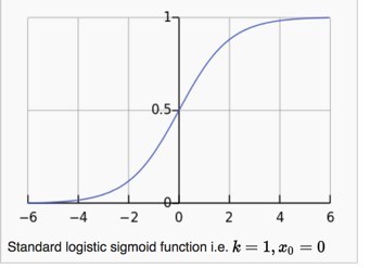
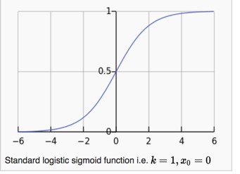
The graph above shows a logistic function that maps out a sigmoid curve… otherwise known as an S-curve.
This function was popularized by mid-19th-century scientist Pierre Francois Verhulst who applied it in his study of population growth.
Verhulst found that population growth follows a certain S-curve. It grows at a steady state until it hits a certain point where it grows exponentially. This exponential growth sustains until the system hits a saturation point where it slows and eventually stops.
The S-curve is one of those strange universal laws that shows up all over the place. Similar to how power laws, as put forth by Pareto, dominate nature and the law of entropy permeates the universe, so to does the S-curve show-up time after time in natural systems.
The S-curve has been successfully used in projecting growth in new technology adoption (we used it to analyze Apple’s business and iPhone adoption rates), to biological systems, nonlinear geoscience relationships, economics, demography and the list goes on.
You’re probably wondering why I’m talking about some 19th-century Belgian scientist, logistic functions, S-curves… and all this jazz.
Fair question.
Here’s the reason:
The S-curve lies at the foundation of what I think will be one of the largest global macro forces driving markets over the next decade.
We’re about to begin seeing its effects very soon.
Put simply, THIS WILL BE BIG.
Let me explain.
French philosopher Auguste Comte, rightly said that “demography is destiny”.
He was referring to national power. But, if you take demography and combine it with rising wealth, then you have economic and market destiny as well.
The IMF wrote recently that, “History has shown that as countries become richer, their commodity consumption rises at an increasing rate before eventually stabilizing at much higher levels.”
The more wealth people have, the more non-essential goods people buy, and the more commodities they consume.
There’s a very interesting and well-documented relationship between rising GDP (as noted by GDP per capita) and commodity-intensive consumption. In other words, once a country hits a certain level of GDP per capita (ie, wealth) they begin to consume a lot more oil, gas, wheat, copper, livestock etc… This consumption grows exponentially.
Can you guess what type of shape this gdp/commodity consumption relationship takes?
That’s right, an S-curve.
The chart below shows the S-curve (on top) and per capita energy consumption on the bottom.

When a country’s GDP per capita hits the ‘Tipping point’, energy consumption begins to rise at an exponential rate.
The same S-curve dynamics occur in agricultural consumption too.
Once a country passes the GDP per capita tipping point, they begin to eat significantly more protein.
Raising livestock is over seven times more grain-intensive than producing for a simple plant-based diet. The resulting impact on the agriculture sector is significant.
Keeping track of where the world’s population sits on the GDP per capita S-curve, or let’s call it the wealth S-curve, is important.


Leave A Comment