There aren’t many topics I know deeply, but financial data is something I definitely understand well. And, as a veteran of the wonderful world of financial numbers, I want to let you know something: there is plenty of dirty data out there, especially in real time.
The dirty data isn’t deliberate. It isn’t nefarious or some kind of kooky conspiracy. It’s simply flawed. And, in high speed markets, even if the data is 99.8% clean, a data “spike” is going to stick out like a sore thumb.
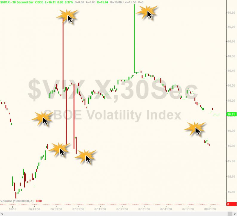
It seems to me that the good folks at ZeroHedge seem to interpret such things differently, such as this chart they published of the intraday VIX:
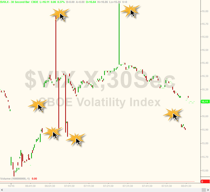
They feature it in an article – – and they’ve done this kind of article any number of times – – called VIX Fat-Finger-Frenzy Sums Up The New Normal Markets.
When ZH has done articles like this in the past, I’ve mentioned in the article’s comments section that the zany charts are simply chock full of dirty data, and it should be interpreted as such. Yet the “fat finger” articles keep appearing so, on my own little corner of the web, I’d at least like to set the record straight.


Leave A Comment