
Good evening, Slopers. I was going to bombard you with ETF charts, to assuage my utterly misplaced blogger’s guilt, but I landed on the first one – DBC – and figured it was enough. Allow me to share this with you, augmented with some embellishments:
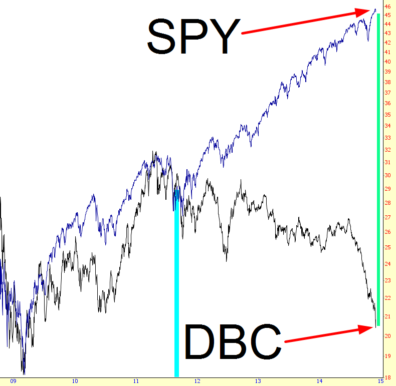
You will note something quite interesting: up until October 2011, commodities and equities had an awfully strong positive correlation. In retrospect, the rise from March 2009 until the summer of 2011 was pretty much justified, given the terrible beating-down that had taken place with equities.
However, after the last meaningful drop in equities (over three long years ago……..) the Federal Reserve went full ‘tard and made clear their utter and unwavering commitment to enslave future generations of taxpayers so that present-day billionaires could get billionaire-y-er. The cyan bar I’ve placed on the chart delineates these two eras.
It’s pretty sad to think that the insanity of TARP and QE1 seem relatively sensible in retrospect, but honestly, until October 2011, we were still on the sensible side of the looking glass. Since then, as you can plainly see, what is representative of the true economy (by way of the commodity ETF, symbol DBC) and the fantasy-land Yellen pipe-dream (the SPY) have drifted farther and farther apart.
The spread now, tinted in green, is as wide as Oprah’s elastic waistband. Take heed. If these two even think about shrinking their chasm-like gap, even by a modest amount, equities are going to get their cojones kicked in.


Leave A Comment