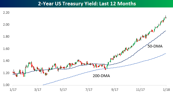
Lately, we’ve been highlighting a number of crazy streaks involving the steadiness of equities in the last several months, but have you seen a chart of the two-year yield lately? While the yield had its share of ups and downs during the first three quarters of 2017, ever since then it has been on auto-pilot to the upside, rising from 1.4% up to over 2%. Looking at this chart, there has been a consistent gap between the current yield and its 50-day moving average to the point where the yield has finished each of the last 98 trading days at least one standard deviation above that level.

Look at the chart above again, because it’s unlikely you will ever see anything like it in a long time, at least if the last 40+ years is any indication. That’s because there has never been a time in the two-year Treasury’s history where it has been more than one-standard deviation above its 50-DMA for this long. Conversely, there has never been a streak where the yield on the two-year was this far below its 50-DMA for this long either.
The chart below shows historical streaks (in trading days) where the two-year US Treasury yield was more than one standard deviation above its 50-DMA or more than one standard deviation below it.In terms of closes above that level, the longest streak prior to the current one was back in 1994 when there were actually two back to back streaks of 70+ trading days.If you don’t remember 1994, it was another period where short-term interest rates steadily rose from just under 4% to just under 8% following a long period of dormancy. That increase in rates began at a level of culminated with the bankruptcy of Orange County, California in December 1994. On the downside, the longest streak where the yield on the two-year closed more than one standard deviation below its 50-DMA ended in January 1985 during a period where the yield declined from close to 12% to just under 10%.


Leave A Comment