
The bull market began back in 2011 as the last inflation hysteria blew out. The key rally came in spring/summer of 2014 when a majority were still touting the death of the dollar and the rise of the euro. At that time I had targeted the euro to extinguish at around 140 +/- (it topped at 139.93 in early 2014, close enough for government work) using monthly charts but had no idea how strong the dollar would then become.
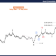
We charted its early rally by daily charts and then made kind of a big deal about it when it broke out above the first support level (then resistance) noted below. This went hand in hand with strengthening signals in the economy. USD has since gone on to establish new support levels and currently targets 105 (+/-) by holding support levels to its big breakout pattern. All good, yeh?

Yeh. Except that the economy is now ‘servicing itself’ as we have shown that health services, leisure and entertainment services and various other services, i.e. the back end of the economy, are doing all the lifting now. Manufacturing is flagging, exports too. The question is how long can this be sustained?
Under a certain scenario, the US dollar will run with the gold sector. That is why, while maintaining a bearish stance on the sector, I certainly do not fear the strong dollar as a gold bug. We are in the process of weeding out the charlatans, the easy answer brigade, the “Chindian Love Trader”(s) and all the other noise. When the relentlessly strong USD wears at the economy and stock market, the right scenario will be in play. Here is a cute little chart we showed in NFTRH 369…

As gold rises vs. silver amid global economic stress, the US dollar is naturally supported because it is after all, the other Horseman.
Draw your conclusions.I’ve already rambled beyond what I thought would be a quickie chart update.


Leave A Comment