This week’s economic calendar is pretty light. Market participants will be looking to an early getaway for the long weekend. While there will be plenty of entertaining FedSpeak, I expect a different topic to be at the fore. Pundits will be asking:
Should investors react to the oil price rally?
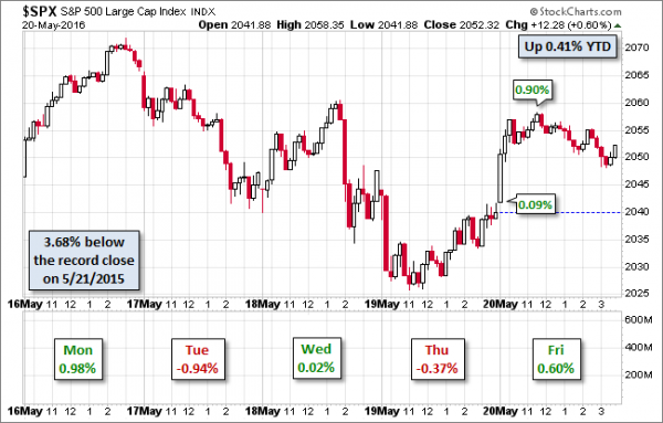
Last Week
The news was pretty good, but the stock market was not.
Theme Recap
In my last WTWA, I predicted that the punditry would be asking whether it was “springtime for housing”. That was the recurring topic as housing news was reported on several different days and garnered plenty of discussion. Competition came from the Fed Minutes, some dramatic earnings reports, and the election race.
The Story in One Chart
I always start my personal review of the week by looking at this great chart from Doug Short. He has a special knack for pulling together all of the relevant information. His charts save more than a thousand words! Read his entire post where he adds analysis and several other charts providing long-term perspective.

The News
Each week I break down events into good and bad. Often there is an “ugly” and on rare occasion something really good. My working definition of “good” has two components. The news must be market friendly and better than expectations. I avoid using my personal preferences in evaluating news – and you should, too!
The economic and market news, on balance, was pretty good.
The Good
The Bad
The Ugly
State and local pension funds. Chicago provides an example. A decision of the Illinois Supreme Court struck down an “overhaul” of the system, adding $11.5 billion to the deficit, now $18.6 billion. The fund covers 70,000 workers and in the absence of any changes, will run out of money in ten years. (Crain’s Chicago Business)
Noteworthy
Try this financial literacy quiz designed by economists from Wharton and George Washington. (via Shawn Langlois) I am confident that WTWA readers will do well. Keep in mind that less than 1/3 of the population could get all three questions right!
The Silver Bullet
I occasionally give the Silver Bullet award to someone who takes up an unpopular or thankless cause, doing the real work to demonstrate the facts. Think of The Lone Ranger. This week’s award goes jointly to Gene Epstein of Barron’s and New Deal Democrat of the Bonddad Blog and xe.com. Both take on the frequent current scary articles about the “flattening” yield curve, citing the yield difference between the ten-year and two year notes. That spread is currently 0.94 percentage points. Those on a mission often cherry-pick the part of the curve to analyze, and cry alarm whenever it gets a little smaller.
Epstein points out that until the curve actually inverts (a spread of less than zero) there is not a reliable recession indicator.
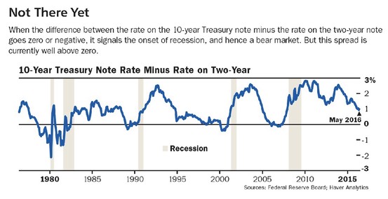
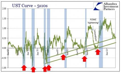
NDD has a great article with plenty of charts. He calls out the “doomers” with this commentary and chart:
In the last week or so there have been a spate of articles – from the usual Doomer sources but also from some semi-respectable sites like Business Insider vans an investment adviser or two ,see here ( https://lplresearch.com/2016/05/19/is-the-yield-curve-signaling-trouble-… ) – to the effect that the yield curve is flattening and OMG RECESSION!!! Here’s a typical Doomer graph – that draws a trend line that ignores the 1970s and neglects to mention that 2 of the 4 inversions even within the time specified don’t fit:
I wish that more publications would recognize the Silver Bullet winners and writers like them. It is difficult to call out weak and biased posts. There is little reward for good and courageous analysis.


Leave A Comment