
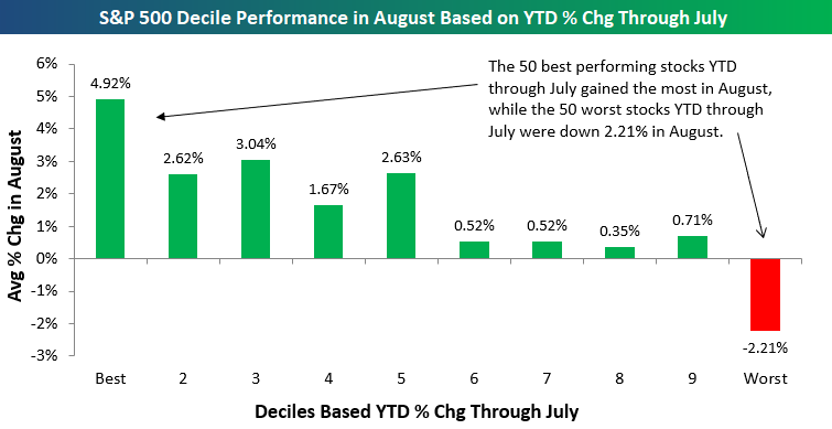
Below we show our decile analysis of S&P 500 gains in August. To construct these analyses, we show how each 10% bucket of stocks in the S&P 500 (50 per bucket) by a given metric performs. In this example, we’ve broken the S&P 500 into deciles based on their percentage change in the first 7 months of the year through July. Over the course of August, performance in the other 7 months was highly correlated to performance this month. As shown in the chart below, the 50 best-performing stocks YTD through July were up almost 5% in August, with the 2nd through 5th deciles also performing quite well. The bottom half of the market in terms of YTD performance through July generally didn’t do as well in August. That was most true for the 50 stocks that performed the worst through July, which dropped on average 2.2% in the month of August. Owning winners is often derided by contrarians as a way to underperform, but the decile analysis below is one example of momentum begetting more momentum in financial markets.


Leave A Comment