It is hard not to notice that the chart above has a lot less red in it than it has in some time. That is true of the month to month data as well as the year over year changes. There has been a widely reported gap between so called soft data – surveys and polls – and the hard data – actual economic activity reports. Bulls say the gap is there because the soft data always leads the hard data. Bears say the soft data surge is about policy changes that aren’t happening, at least not yet and maybe not for quite a while. But the real problem is that there is no context to the data, whether month to month or year over year. Yes, the YOY numbers are better than last year – but are they good? Unfortunately, the answer to that question is no in many cases.
Take Factory Orders as an example, a report released last week. On the surface it looks like a very encouraging report. Orders were up 1.0% from last month and last month was revised higher from an initially reported 1.2% gain to 1.5%. Year over year orders were up 7.3%. The month to month figure was in line with expectations. There was some disappointment in the capital goods part of the report but overall, pretty good, right? Let’s add that context we talked about.
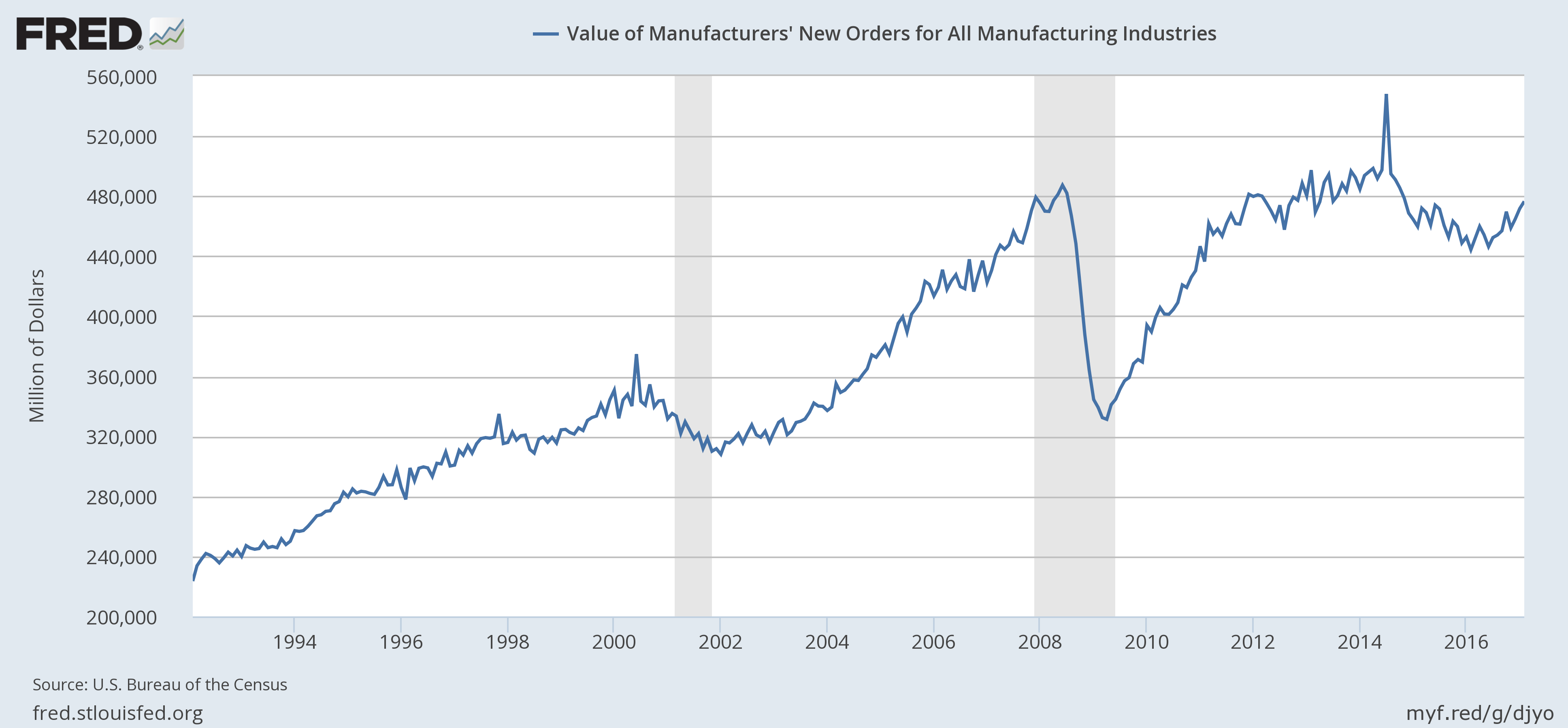
Factory orders were indeed up from last month and last year; the short term trend is positive. Orders are also less than they were in December 2011 and December of 2007. Lost decade anyone? Okay, if you insist on being completely accurate, lost 9 years and 2 months?
Construction spending presents a similar picture:
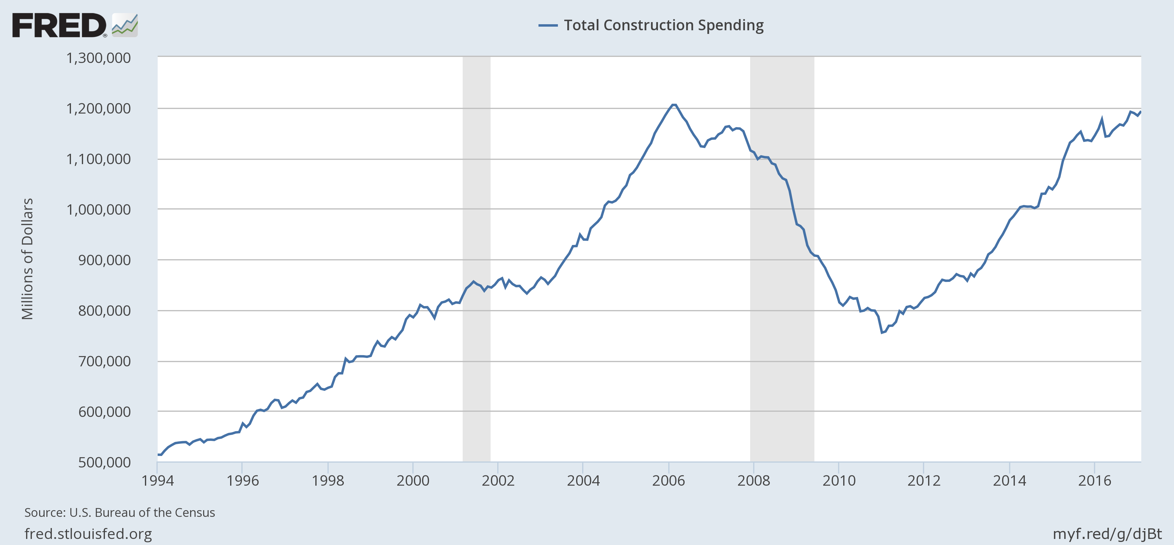
Construction spending was up 0.8% month to month and the reading for January was revised higher (still a negative number). Year over year spending was up 3%. And yet spending is also just back to where it was in January 2006. I think we forget sometimes just how big a hole we dug for ourselves – or maybe more accurately dug by the Fed and our elected officials – in the 2008 wipeout.


Leave A Comment