
We know that the Dow Jones Industrial Average is off more than 10% since July 1 in a correction that has investors all over the world rattled.
But here’s the thing… I’ve been able to predict every step of the sell-off, whenever stocks were set to make the next move down. Right before each drop, I told investors what they could do to protect themselves and even make some nice, easy money during the sell-off.
I made the predictions here in Money Morning, and on FOX Business, too.
But what I didn’t tell FOX audiences was just how easy it is to predict when these dives are going to happen.
In fact, it’s incredibly easy – especially when the market is about to move lower. You just need to know how to read “between the lines”: channels, support, and resistance.
That’s just what I’m going to show you today: How to read the markets’ future right now. That way you’ll be able to see when the markets are ready to go through a big, juicy correction.
We’re having one right now, but you’ll be able to see it won’t be long before another one comes along.
Here’s what I like to call “Technical Analysis 101.” It’s fun, easy, and best of all, it can make you a fortune.
Let me show you my charts…
The Key to Predicting Stock Market Corrections
As you can see in Chart 1, this one-year chart of the Dow Jones Industrial Average is broken down into three timeframes: T1, T2, and T3.
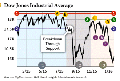
For now, I want you to focus just on T1. Imagine there is nothing to the right of that time frame, no T2 or T3.
If you were looking at a chart of the Dow over that period (T1), even if your chart went further back, you would have seen that the market was going sideways.
I looked at that and thought, “We’ve made nice new highs in this long bull market and now we seem to be going sideways. We could break out, make new highs, and start another leg higher. Or the market could be getting tired and investors might be thinking about taking profits here.”
So I drew a couple of channel lines.
Channels are parallel lines that go sideways, go up, or go down and look like a channel.
I look for channels, but they’re not always obvious, and they can be drawn differently by different people depending on how they interpret a given chart.
But for the most part our channels and support and resistance lines will all be pretty close; close enough to not matter how exact they are – they don’t have to be exact. Drawing channels and support and resistance lines is more art than exact science. As long as you have a ruler and can draw a straight line, you’re going to be as good at this as I am.
Looking at T1 you can see there’s a pretty clearly defined sideways channel there. So I drew Line 1 to delineate the top of the channel, and I extended it all the way to the right of my graph. I also drew Line 2 to delineate the lower channel line.
If you were just looking at a graph of T1, your line would end where T2 starts. The thing about drawing channel lines and support and resistance lines is that you always extend them out. Draw them going forward so you can see in the future, when you have more graphed data, where the old lines are. I keep my old charts and use them to recreate my existing lines when I print out updated charts. I draw the old lines onto the new charts.
The top line of the channel actually becomes an upper channel resistance line, and the bottom channel line becomes a lower channel support line. So now you have a channel and support and resistance lines. Sideways channels, especially the longer a sideways channel extends, are very important patterns to watch.


Leave A Comment