
By Roger Thomas
It’s jobs week. This month’s BLS report might be the most influential jobs report in a while. Then again, if things come in in-line with expectations, the jobs report could be a complete dud.
What’s not up for debate is that Federal Reserve officials will be pouring over many of the BLS’ data points before it arrives at a rate decision in September.
Here’s a look at the five most important jobs figures due out this week.
Charts of the Week
#1 Year-over-Year Job Growth: Will Job Growth Continue to Decelerate?
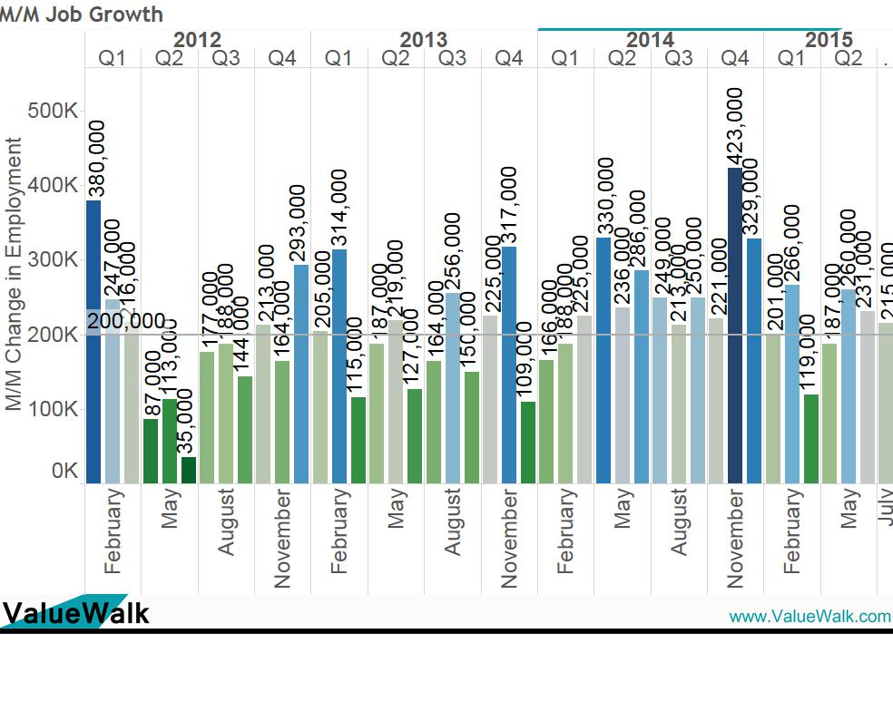
Job growth is thought to be the most influential data point due out Friday. The market will undoubtedly pay an inordinate amount of attention to the month-over-month (M/M) net new jobs figure, with the current consensus at 217K.
The 217K would be a slight increase from the 215K in July. Here’s the M/M picture.
Charts of the Week
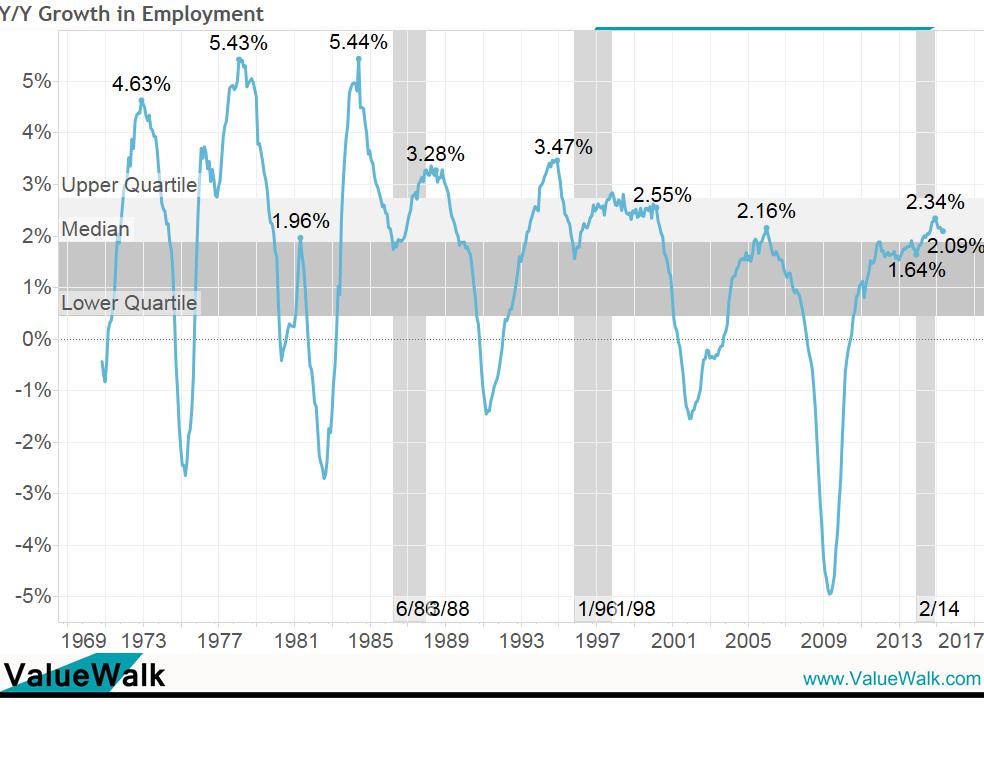
The market ought to pay more attention to the year-over-year (Y/Y) picture, in that this figure is largely a better indicator of the business cycle trend. By this measure, the labor market has been decelerating since February 2015. Since February 2015, Y/Y job growth has decelerated from 2.34% to 2.09%, a telling deceleration in business cycle dating.
Charts of the Week
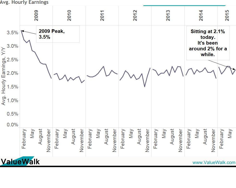
#2 Average Hourly Earnings: Will There be Any Sign that Wages are Accelerating?
Inflation is usually subdued when wage growth is weak. That’s the case today. Average Hourly Earnings are floating at 2.1% Y/Y, well below the peak in 2009 at 3.5%.
Should this show any evidence of wage acceleration, it probably would provide further grounds for the Fed to act.
Charts of the Week
#3 Full-time Employment: Will the Full-time Picture Continue on Its Incredibly Strong Streak?
It’s been an amazing year for full-time employment. Although job growth has floated around 200K to 250K for most of the past year, full-time employment has been much higher, with part-time jobs making up the difference.


Leave A Comment