
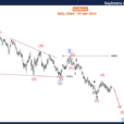
I’ve been following gold pretty closely since I first proclaimed, ‘it’s time to get greedy in the gold market,’ when the precious metal fell below $1,100 a couple of years ago. Since then it appears to me that gold has been trying to form a bottom. One major technical obstacle, however, has stood in its way and that was the downtrend line that dates back to the 2011 top.
This week that downtrend line was broken.
Hello again… pic.twitter.com/VsKwTl2VTi
— Jesse Felder (@jessefelder) May 31, 2017
I’ll let StockCharts.com explain what this means:
A downtrend line has a negative slope and is formed by connecting two or more high points. The second high must be lower than the first for the line to have a negative slope. Downtrend lines act as resistance, and indicate that net-supply (supply less demand) is increasing even as the price declines. A declining price combined with increasing supply is very bearish, and shows the strong resolve of the sellers. As long as prices remain below the downtrend line, the downtrend is solid and intact. A break above the downtrend line indicates that net-supply is decreasing and that a change of trend could be imminent.
In short, the break of the downtrend line is confirmation of the idea that a “change of trend could be imminent.” To confirm the trend change from down to up I would simply like to see prices overcome their highs from last summer. On the weekly chart, this would give us a higher low and a higher high, the definition of an uptrend.
In addition to the improving technical picture for gold, I think it’s pretty easy to make the case that gold is cheap. In the past, I have referenced a chart showing real assets have never been cheaper relative to financial assets. Another way to look at this, though, is to compare commodities to equities. This ratio also suggests that real assets like gold are priced to generate far better returns than financial assets like stocks over the coming years.


Leave A Comment