
So the VIX has flatlined.
It’s been meandering along in a sideways direction for nearly four years.
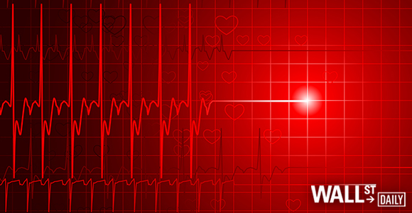
In fact, the four-year chart of the VIX looks like an electrocardiograph (EKG) of a recently diseased person.
Sure, you’ll see an occasional blip.
But not even a dead person has a ruler-straight EKG line.
Sorry, folks — that long, continuous “flatline tone” when you die is mostly a Hollywood fabrication.
I’m covering the VIX today because it was once a key contrarian indicator.
Perhaps it’s time to announce this patient as dead, though.
Let’s check the vitals…
Also known as the “fear index,” the VIX measures the volatility of the S&P 500.
High VIX levels (above 20) suggest a fearful market.
Fearful markets represent great times to buy.
Low VIX levels (below 20) speak to a complacent market.
Complacent markets represent great times to take some profits.
Generally speaking, the VIX climbs about 4% for every 1% fall in the S&P.
The last notable upward blip on the VIX came in September 2015 as the result of a dovish Fed announcement. And it barely moved the S&P’s needle.
I asked my senior analyst, Martin Hutchinson, a simple question…
Is the VIX is dead… or can it be shocked backed to life with paddles?
Hutch’s full report is below.
Ahead of the tape,
Louis Basenese
Chief Investment Strategist
Martin Hutchinson: Today I’d like to talk about the VIX — the Chicago Board Options Exchange Volatility Index — and how it’s useful to investors.
VIX shows the market’s expectations of 30-day volatility. It’s a measure of how much the markets are expected to bounce around in the next 30 days.
It calculates the weighted average of implied volatility of eight Standard & Poor’s 500 index options.
What’s implied volatility?
You take the price of the options and shove it backward through the Black-Scholes options valuation model and out spits the implied volatility.


Leave A Comment