Over the past 7 years, we as well as others (if not those who believe in magic money trees, or managing other people’s money while blogging) have repeatedly said that when it comes to “market” returns, look no further than the size of the Fed’s balance sheet – the single best indictor of where the S&P500 is headed to next.
That is precisely what DB’s Jim Reid did overnight. This is what he says:
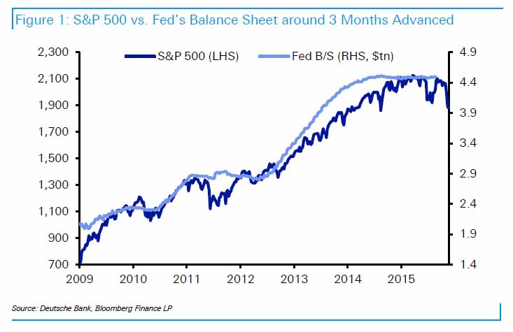
Today we update a chart and table we used a fair amount in 2013/4 looking at the Fed balance sheet and equity and credit performance.

The relationship works best with a 3 month lag (i.e. asset prices move ahead of the Fed) with the table breaking down the post-GFC period into alternate periods of US QE and non-QE. As can be seen apart from the initial Lehman related collapse period, asset prices have done extremely well in the QE periods and generally negatively when the Fed has held fire. The current period is no different.

Obviously such a relationship can’t last forever but it provides evidence of how much influence the central banks have had on asset prices post 2009 and therefore how important they still are. Markets continue to be addicted to stimulus.
Generally we feel that with inflation so low they can provide more if they so desire. Obviously in recent quarters the Fed has tried to withdraw from such a game but we continue to think it’s going to be very very difficult for them to get very far with the danger of a policy error high.
As we said on many occasions last year if you didn’t know the level of Fed Funds and were just given the global data and financial landscape you may easily conclude that the next move should be an easing.
Indeed, and as even the Fed admitted yesterday, it hiked rates just as the “economy was slowing down.” In other words, the first step of admitting policy error has been taken.
The are just two questions left:


Leave A Comment